PPA Parking Kiosk
The Philadelphia Parking Authority is not loved here in Philadelphia. Their attendants have an uncanny sense of knowing when your parking meter will run out and I think actually enjoy towing people. They even had their own reality show for a little while. Despite the malice directed towards the PPA, my team looked at ways we could improve the parking experience - and perhaps smooth the transition between driving, parking and walking in Philadelphia.
Observation
Our first goal was to observe how people used the PPA parking kiosk. After hours of documentation, observation and user-interviews, we felt we had determined a few pain points of the current kiosk.
Expert Knowledge Neeeded
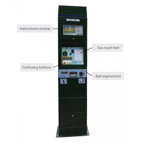
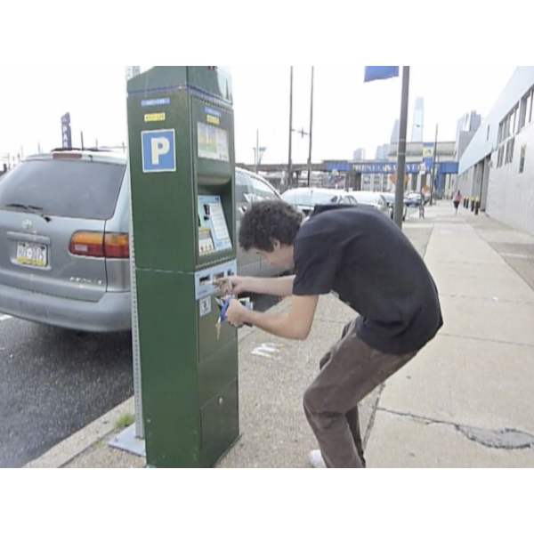
First-time users were often confused with the “correct” way of how to use the kiosk. The instructions were illegible and located away from their corresponding items. The money, ticket and credit card slot were too low, causing people to stoop to feed the money into the kiosk. The buttons added a layer of abstraction since they point to their corresponding commands and those commands change, depending on what stage you're at in the ticket buying process. It was clear first time users of the kiosk were very confused with what they were supposed to do, though experienced users seemed to have no trouble.
Prototyping and Testing
In order to test different interfaces of the kiosk, the team built a foam-core mockup of the current kiosk and tested different layouts and work flows.
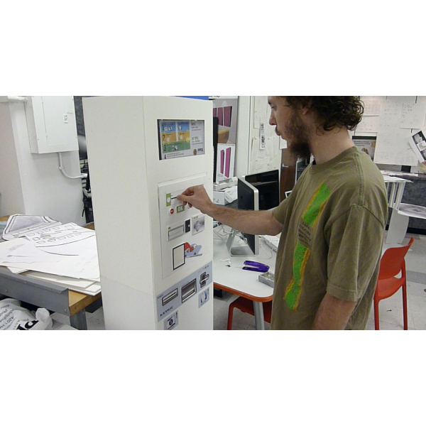
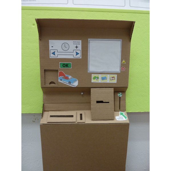
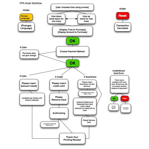
A flow new flowchart and interface layout informed us how the new kiosk could work.
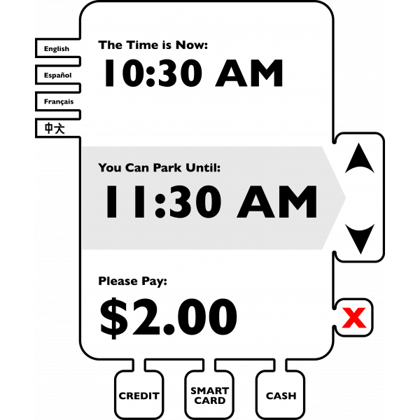
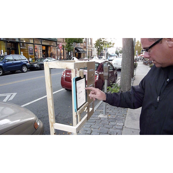
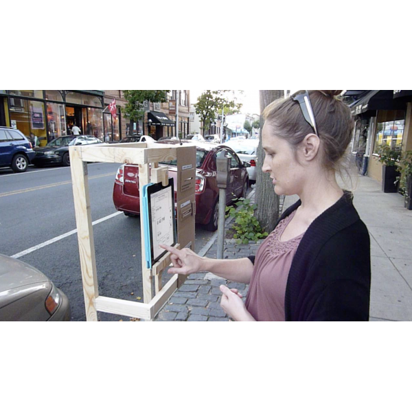
I took the new interface and coded it into HTML in order to make a functional prototype users could interact with. I built a very, very rough wood mockup of the kiosk, set an iPad in it, and asked random strangers on the street to use it. This informed the team whether or not the new interface was an effective solution.
Design of Kiosk
The next step was to find a design that could make the kiosk stand out more and solve for the current kiosk's poor ergonomics.
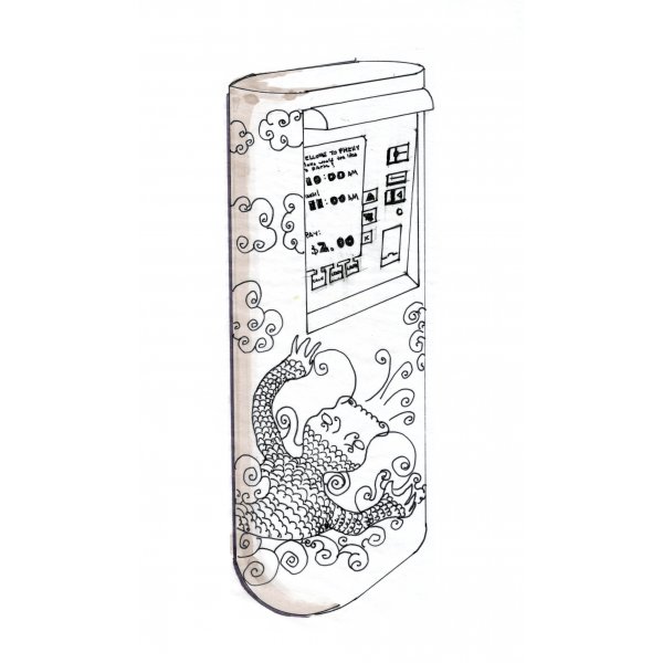
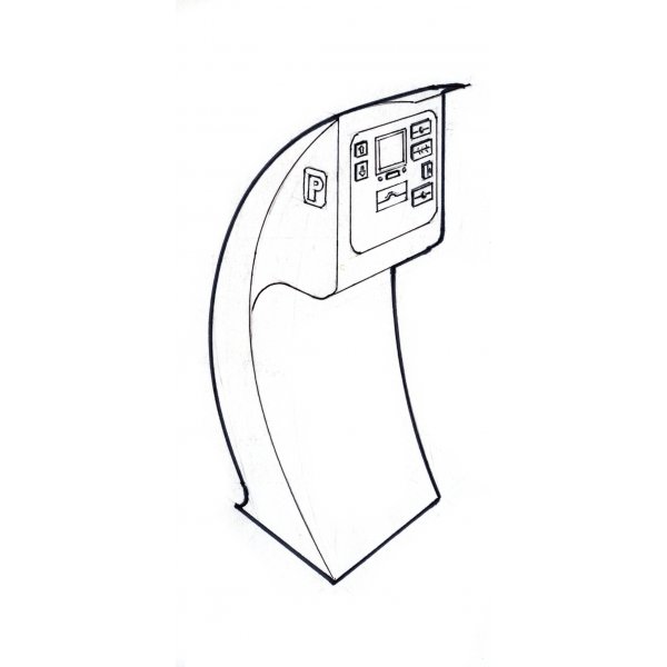
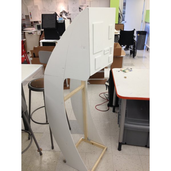
Another foamcore mockup was made in order to reliably test the physical ergonomics of the new kiosk.
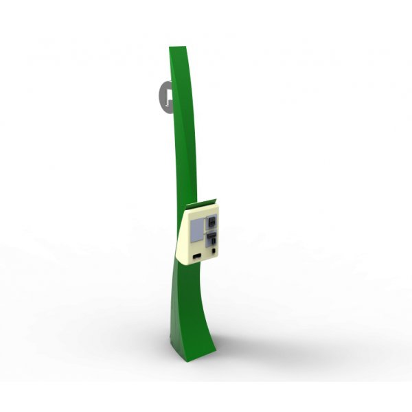
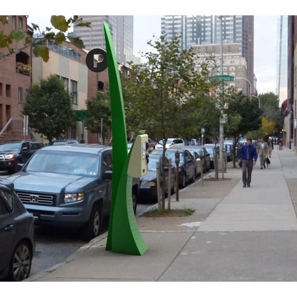
A 3D render was created to show the kiosk in context of its surroundings. Since people complained about the kiosks being hard to find, the signage was accentuated. The inspiration was a blade of grass next to a stream, not unlike trees on the side of a road.
