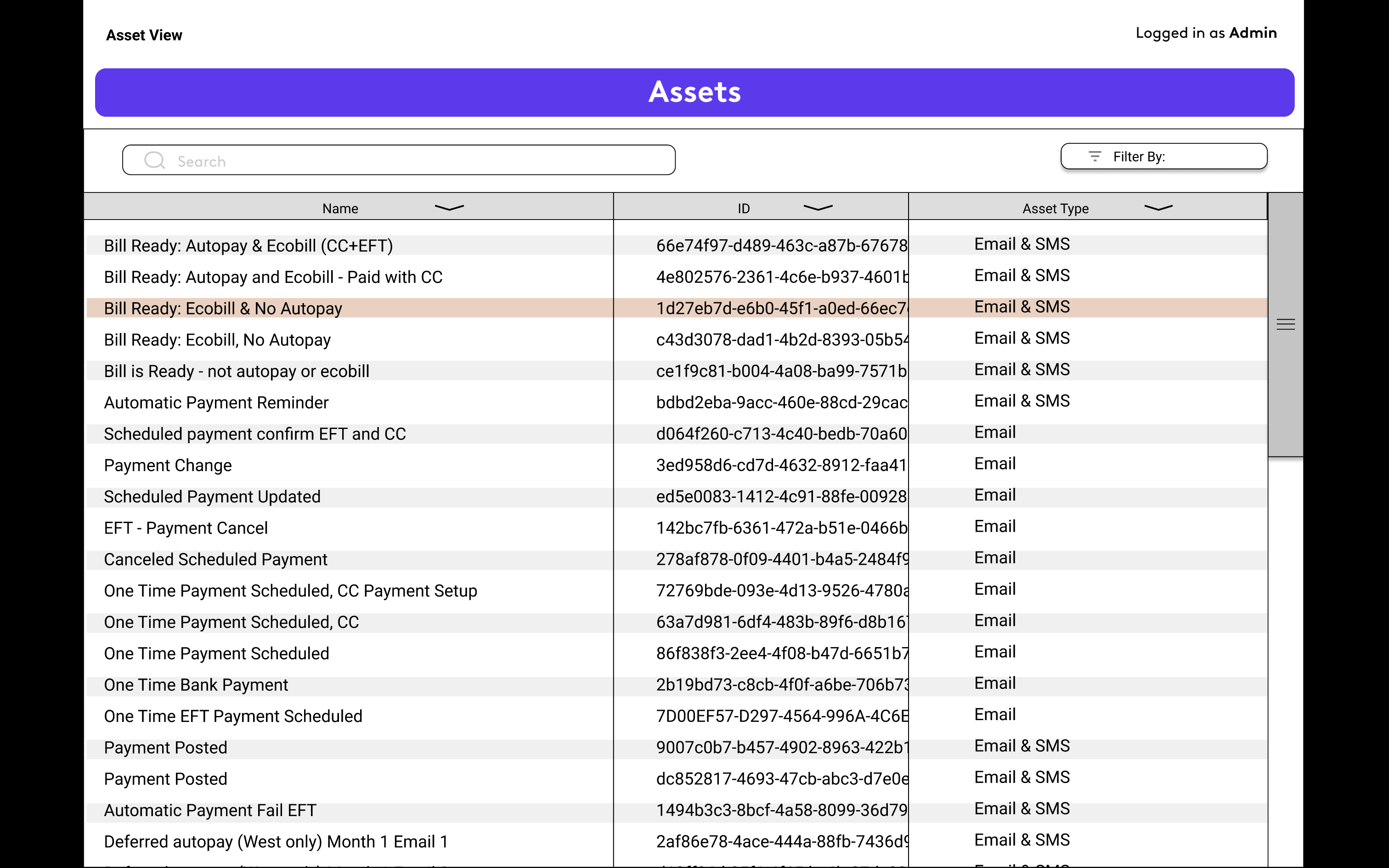
Billing Comms was a project contracted by a major media company. It was meant to be an in-house digital asset management system but also a visual representation of when and where an asset manager needed to supply the right piece of material. Unfortunately the project never got released, however it did get far into development from a third-party contractor who handled the coding. My role in the project was to establish the information architecture, design the user interface and create the wireframes. Initially my ideas started in Sketch then moved to Figma for further collaboration and feedback.
The Journey View
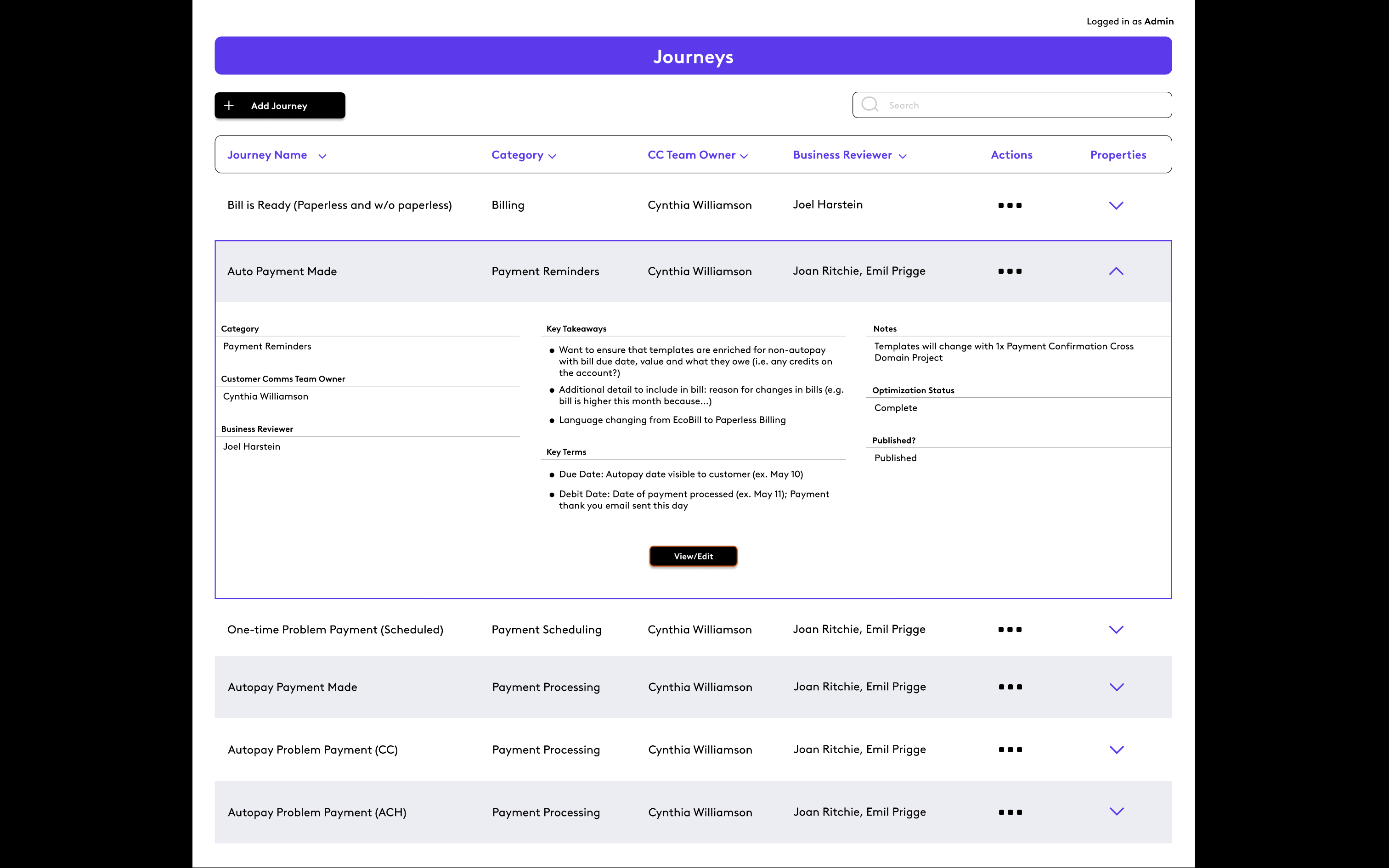
The Journey View was where the user started. Here they could view all available asset "journeys". Each journey represented a flowchart that showed what was needed if a certain set of criteria were met. For example, there were journeys for billing reminders, autopayment dialogues and problems with payment. Some journeys led to other journeys.
The Journey Editor
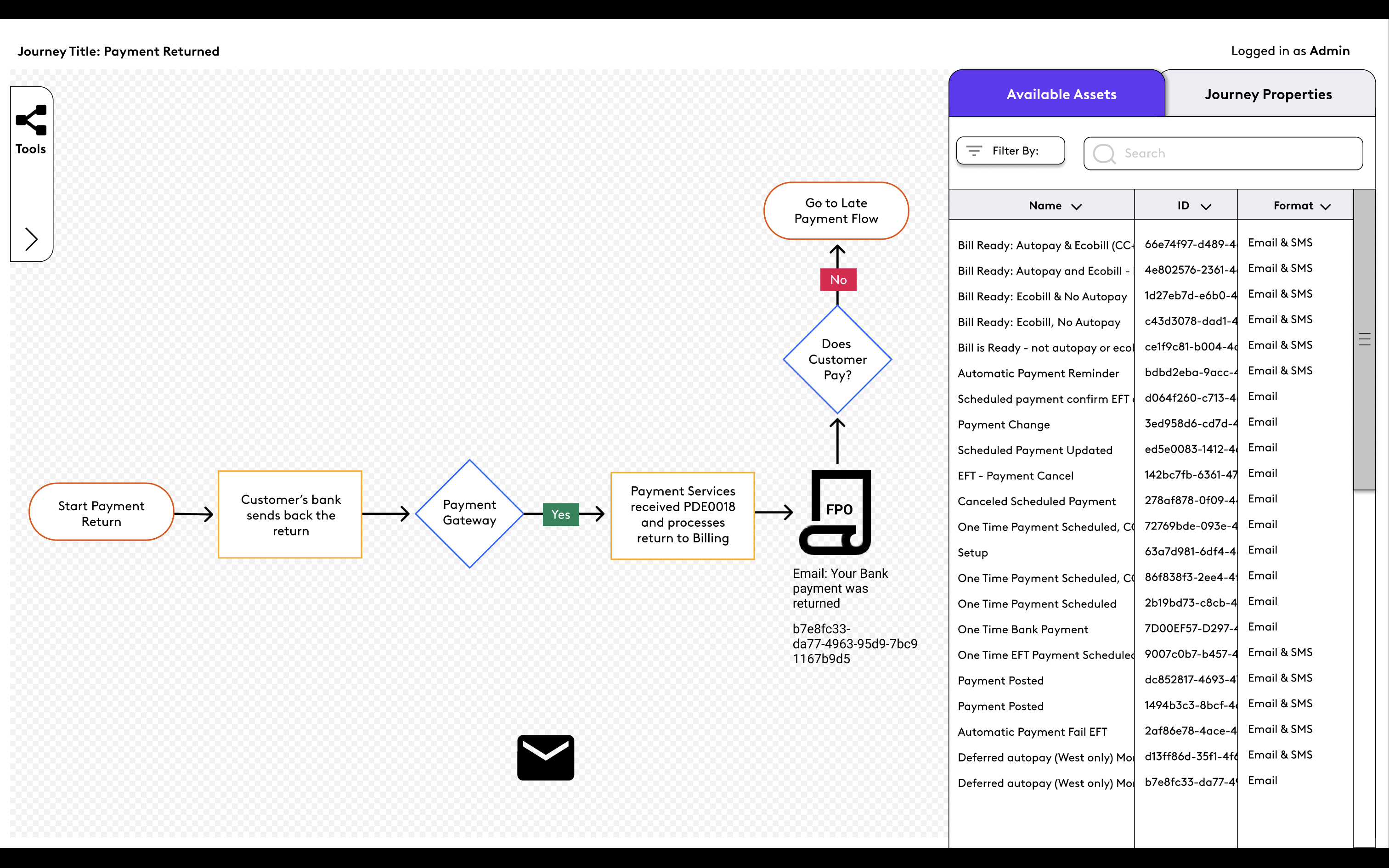
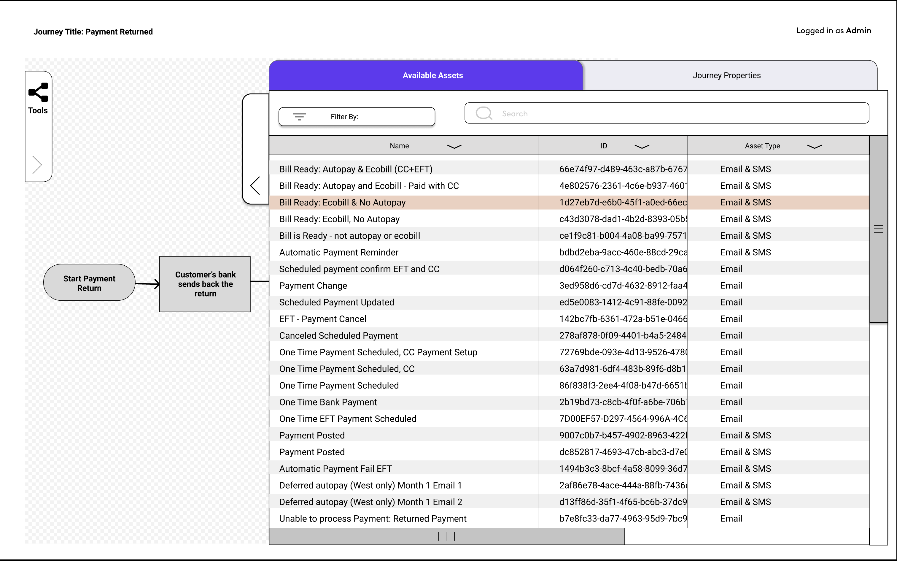
When a user chose a journey, they were taken to the journey editor. Here they could edit or view which asset was needed when. Clicking on an asset icon they could view which asset the title was referring to. Users could also enter edit mode in case the journey needed a new scenario or an asset needed to be placed elsewhere.
The Asset View
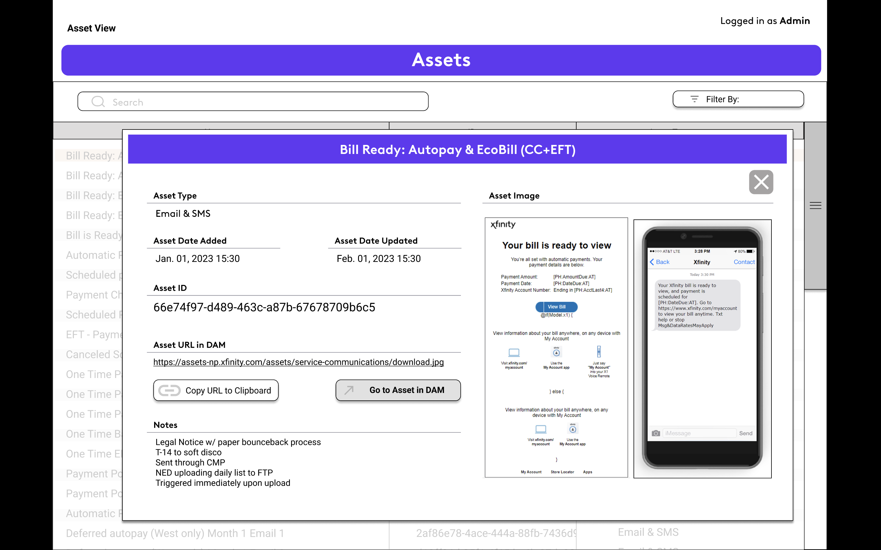
The Asset View appeared either when a user clicked on the name of an asset from the flow, the list of assets on the sidebar within the flow, or in the asset management screen. Here the user would get a visual representation of what the asset looked like. You could also click on the link to where the asset was stored in the company-wide digital asset management system. Other information included notes, IDs and asset type.
