Work

Billing Comms was a project contracted by a major media company. It was meant to be an in-house digital asset management system but also a visual representation of when and where an asset manager needed to supply the right piece of material. Unfortunately the project never got released, however it did get far into development from a third-party contractor who handled the coding. My role in the project was to establish the information architecture, design the user interface and create the wireframes. Initially my ideas started in Sketch then moved to Figma for further collaboration and feedback.

The Journey View

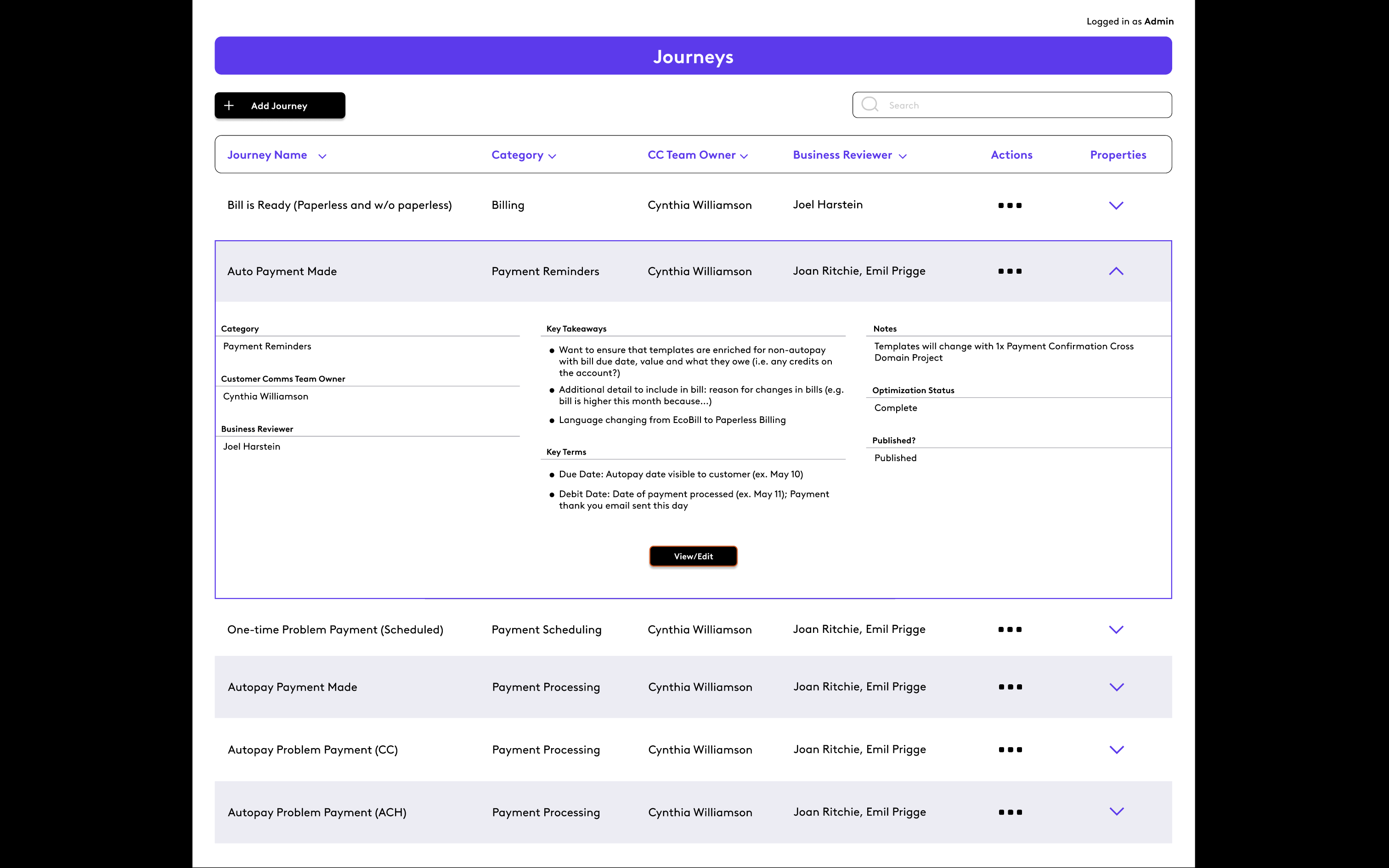
The Journey View was where the user started. Here they could view all available asset "journeys". Each journey represented a flowchart that showed what was needed if a certain set of criteria were met. For example, there were journeys for billing reminders, autopayment dialogues and problems with payment. Some journeys led to other journeys.
Screenshot%202023-12-26%20at%2018.38.44

The Journey Editor

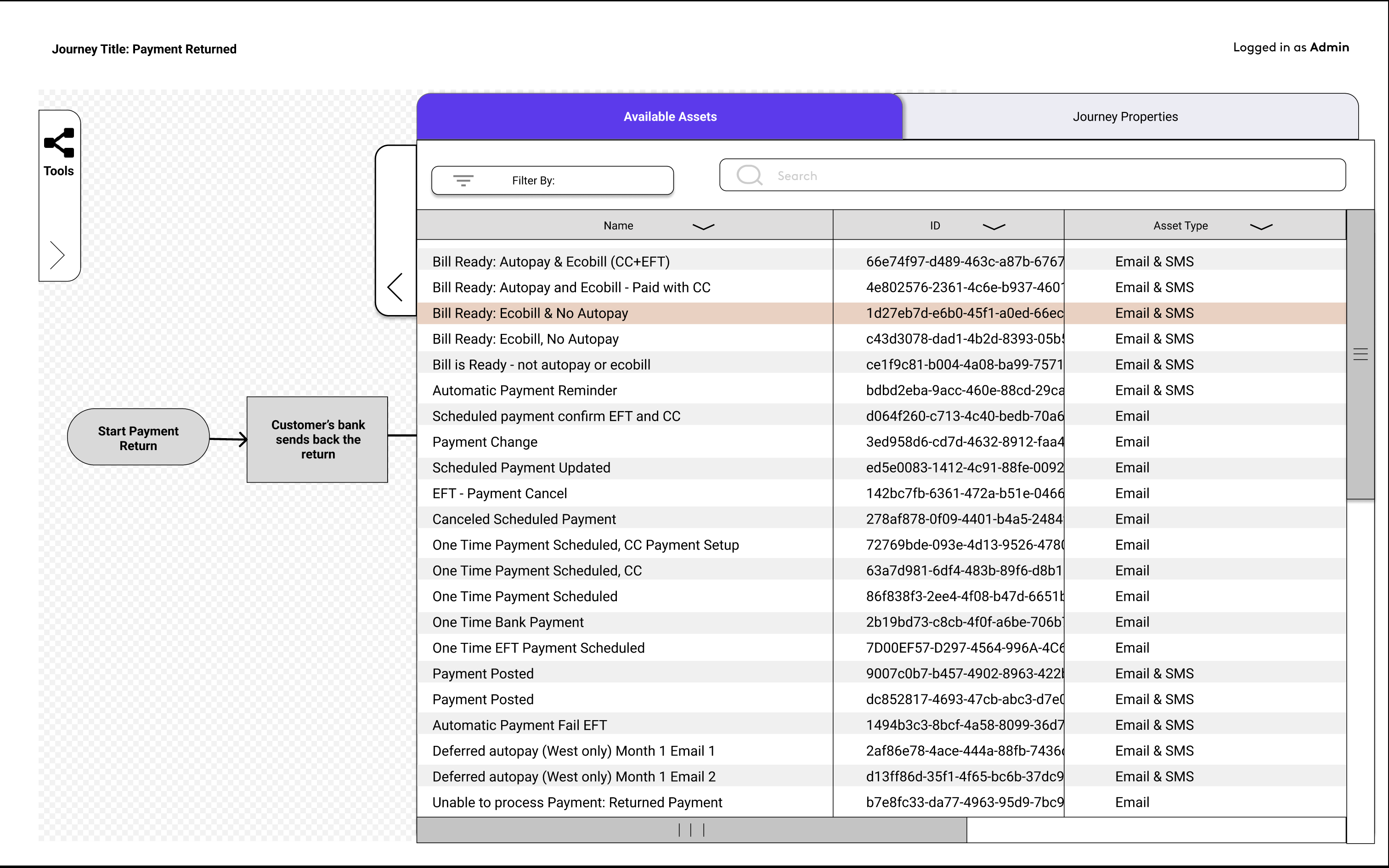
When a user chose a journey, they were taken to the journey editor. Here they could edit or view which asset was needed when. Clicking on an asset icon they could view which asset the title was referring to. Users could also enter edit mode in case the journey needed a new scenario or an asset needed to be placed elsewhere.

Screenshot%202023-12-26%20at%2018.41.34

Screenshot%202023-12-26%20at%2018.42.05

The Asset View

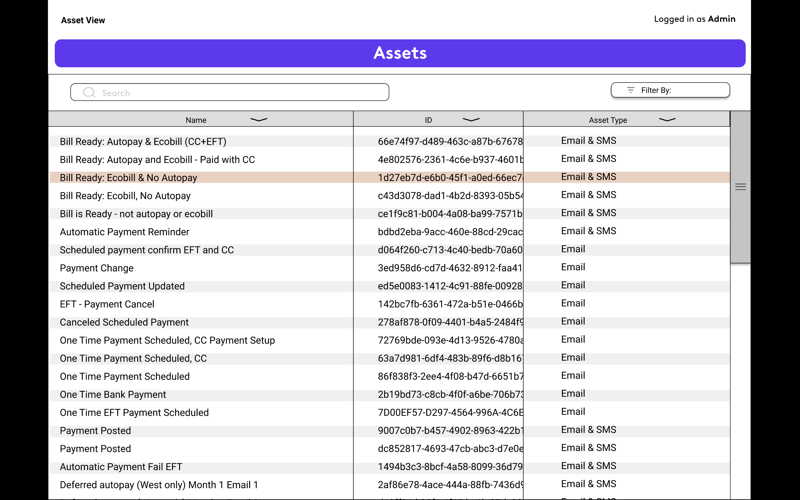
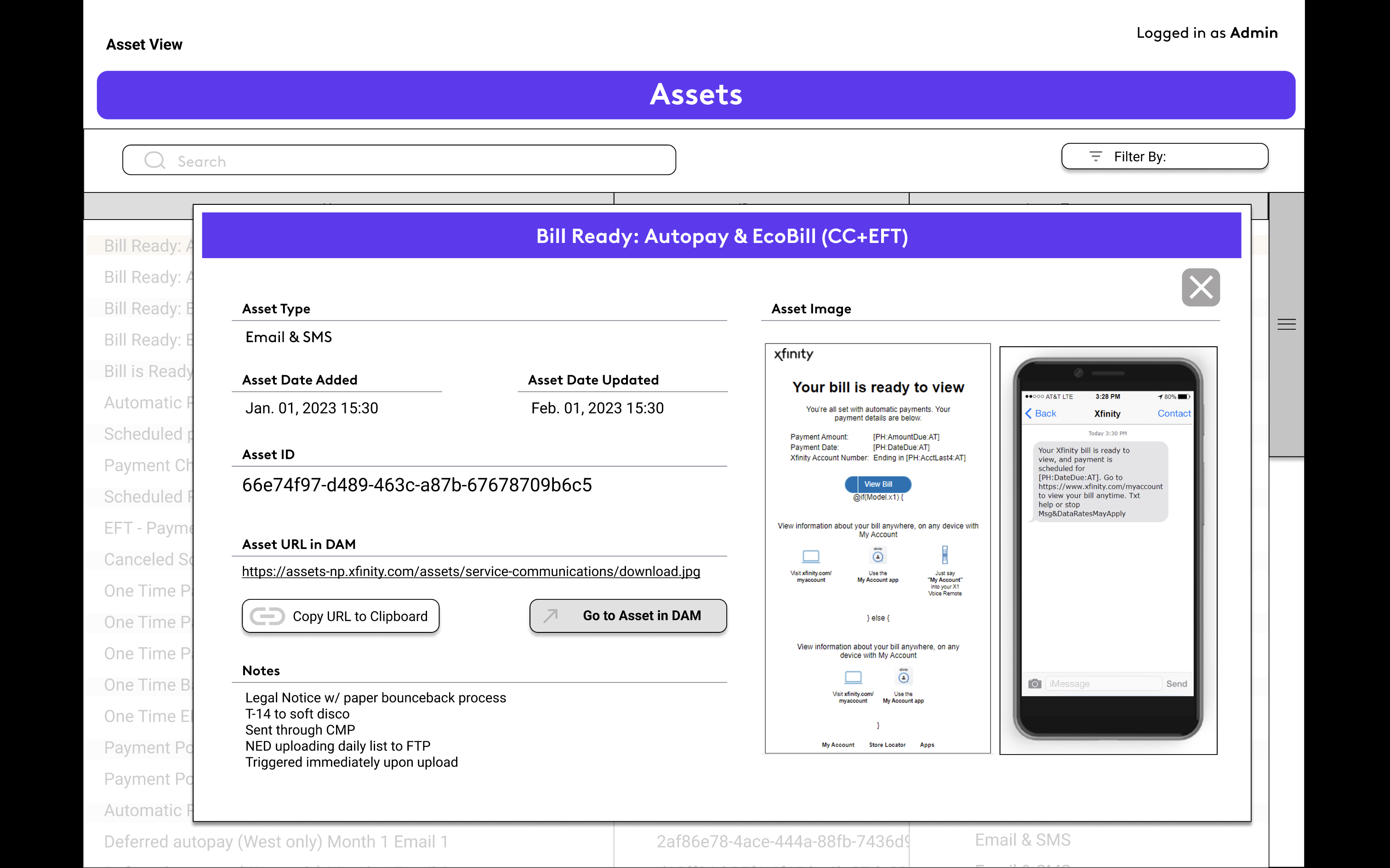
The Asset View appeared either when a user clicked on the name of an asset from the flow, the list of assets on the sidebar within the flow, or in the asset management screen. Here the user would get a visual representation of what the asset looked like. You could also click on the link to where the asset was stored in the company-wide digital asset management system. Other information included notes, IDs and asset type.
Screenshot%202023-12-26%20at%2018.40.59

Screenshot%202023-12-26%20at%2018.41.08

Smart Scale

The goal of this project was to re-think a common appliance and turn it into something with interactivity. I chose the kitchen scale.

Observation

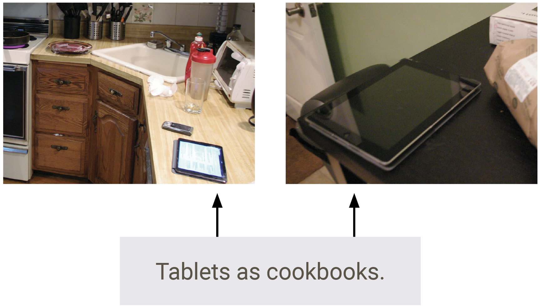
Users often cook with tablets in the kitchen. The tablets, acting as cookbooks, are far from the food because people don't want them to get dirty or wet.

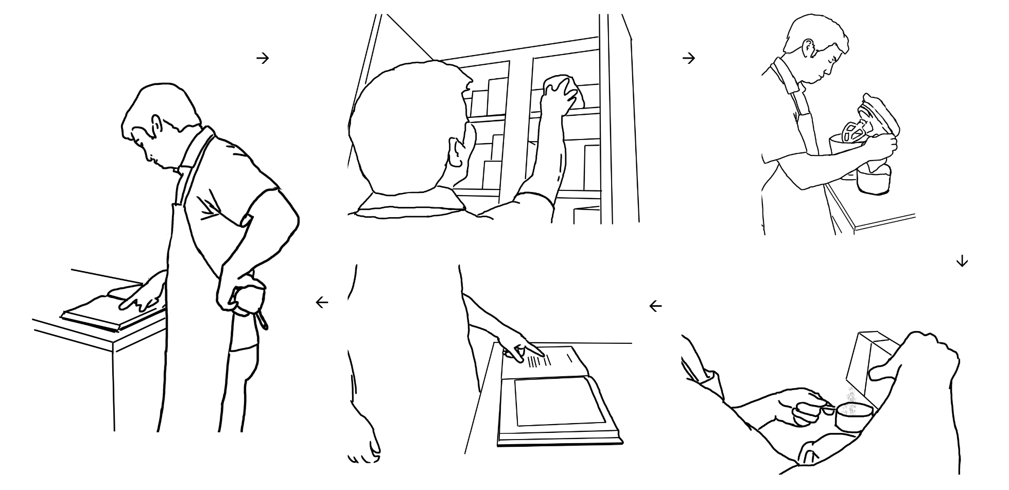
Additionally, when following a recipe out of a book or tablet, the cook needs to move about the kitchen, going from ingredients to cookbook and back again.
Concept & Ideation

Why not combine the recipe reading process with where the cooking is happening? What if the thing you were reading recipes from actually helped you cook? I decided to use a scale as the recipe reading device because measuring with weight is more accurate than measuring with volume. A scale that combines both the recipe and measuring function keeps the focus on the food and eliminates back and forth travel around the kitchen.

Paper Prototypes

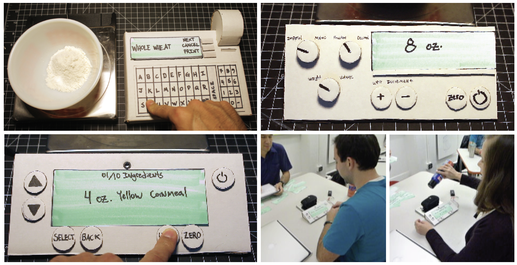
A series of paper prototypes were created to find the most effective user experience. These prototypes allowed me to do basic user testing.
Proof of Concept

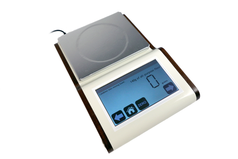
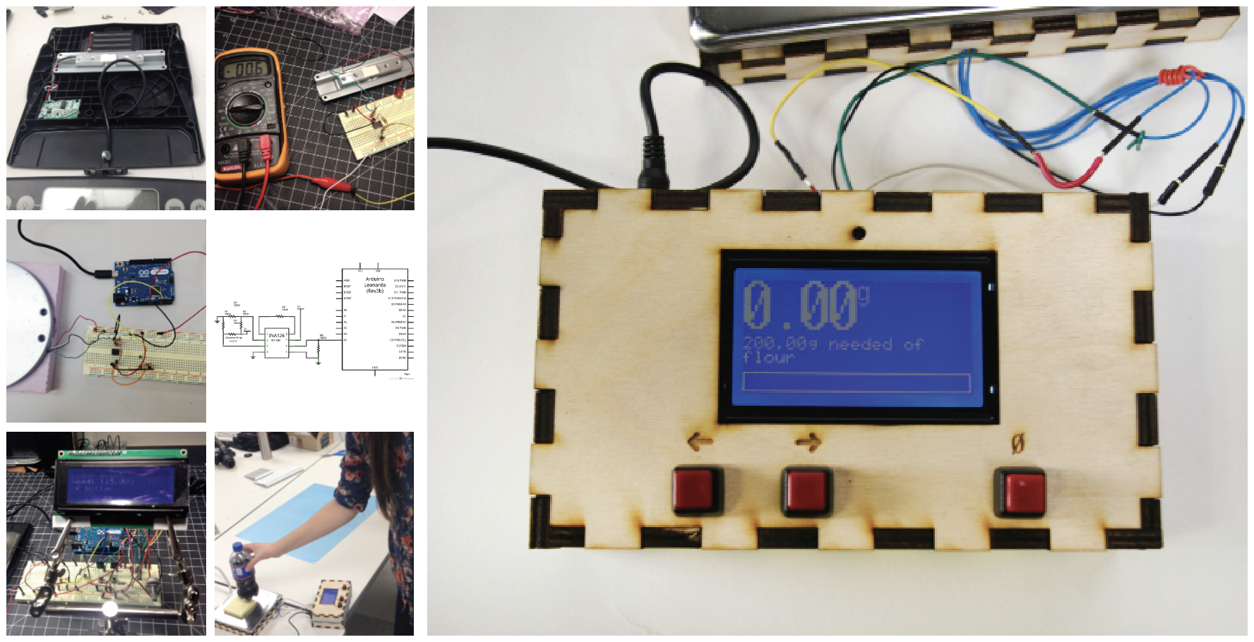
I reverse-engineered a scale and manipulated the parts using Arduino. The scale displays how much of an ingredient is needed. The user accurately measures right on the scale. When ready, the user can advance to the next step, zeroing out the scale for the next ingredient.

Refinement

The scale concept needed to be taken to the next level. Sketches and mock-ups explored the form. The scale was modeled in Solidworks then CNC and 3D printed. Finally, the UI was moved to a touchscreen interface and the Arduino components installed.

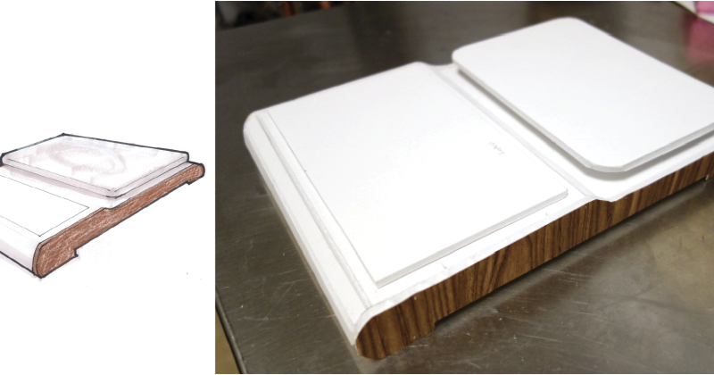
Sketches and foam mockups were made to explore the form of the scale. I used this model for measurements used in the 3D model.

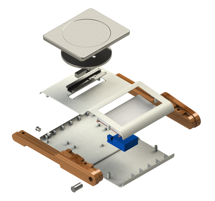
An exploded 3D model of all the planned parts.
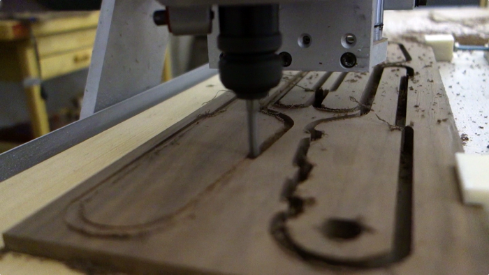
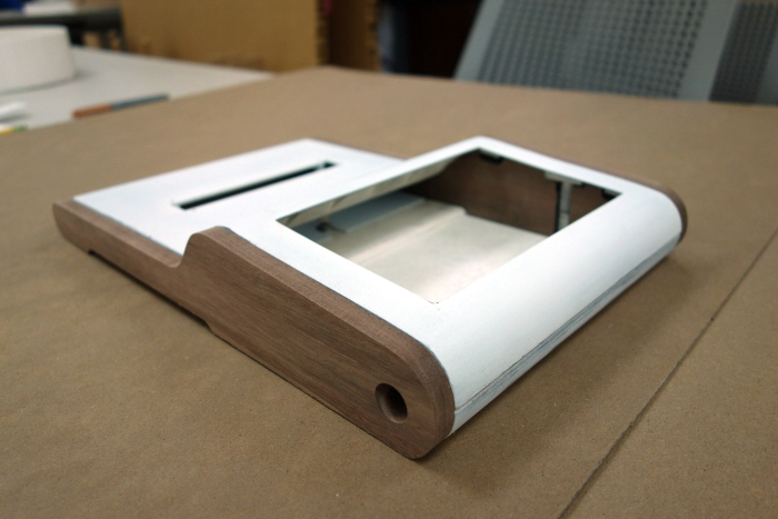
The sides were CNC'd from walnut.

The 3D model was used to 3D print the body and CNC the sides of the scale. The scale after being 3D printed and the sides CNC'd. The insides of the scale were assembled accordingly.

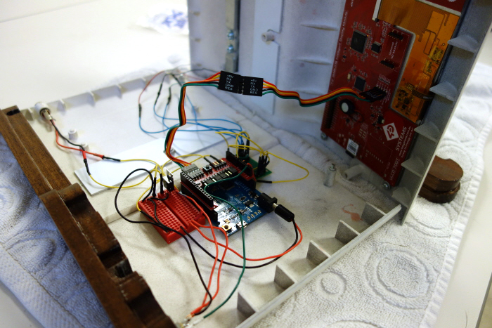
The electronics were installed, including the power button, the scale sensor, the Arduino microprocessor and display.

Functional Prototype

The Smart Scale assists the home chef to cook quickly and accurately. With its big touchscreen and helpful prompts, it’s easy to use with little degree of effort.

Ring Soap

Unilever asked us to re-think the shower experience. We asked ourselves, “How can we improve soap?” This proved our basis for a deeper look into our showering habits. We aimed to create an easy-to-use and ergonomic solution to possibly offer a new route to market.

Observation

Bar soap fell apart and needed a place to sit, often making the shower dirty. Many users preferred body wash to bar soap for convenience and cleanliness of the shower.

Solution

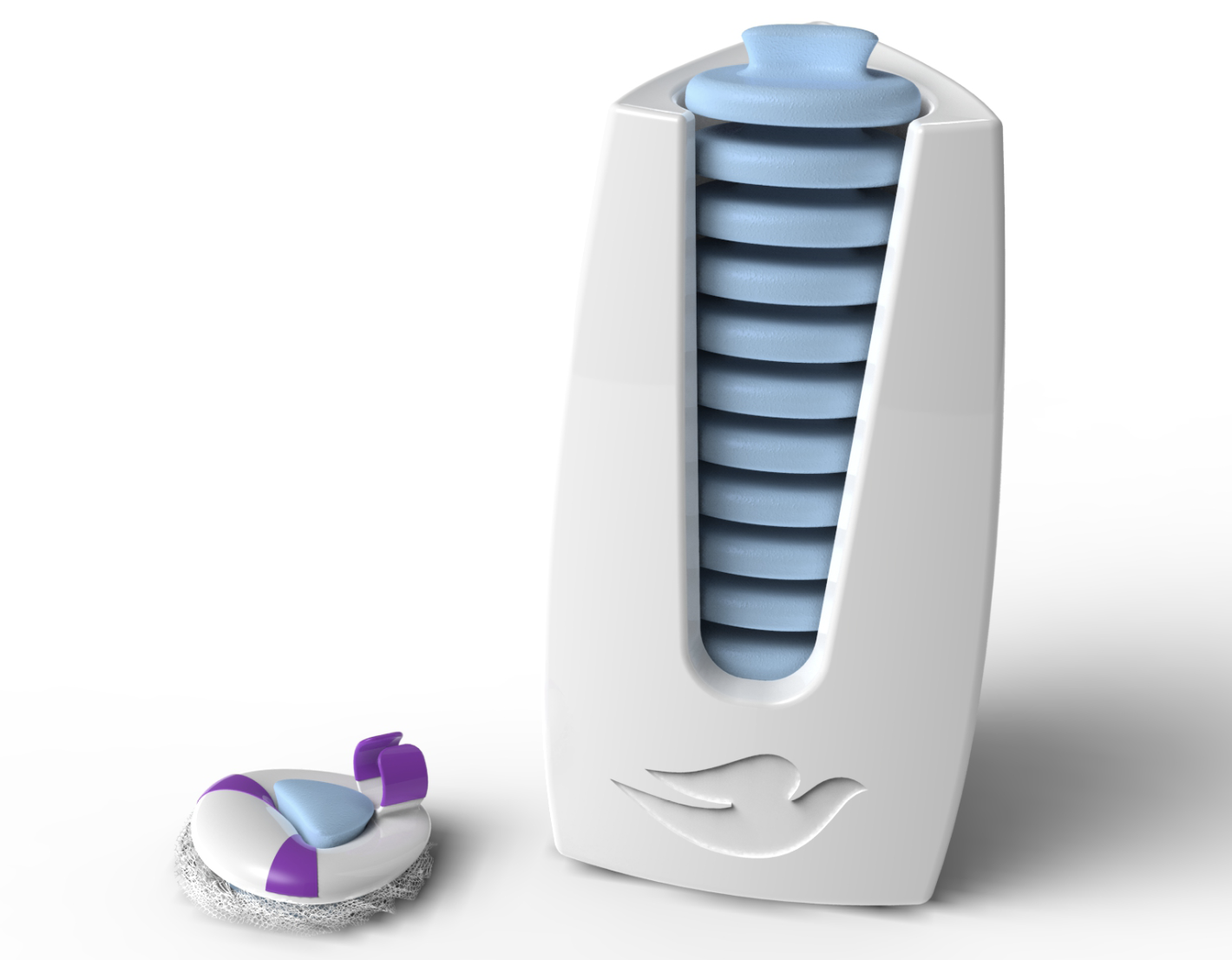
Create a single-serve body-wash/bar soap hybrid that comes as separate units but can be used with a scrubbing device.

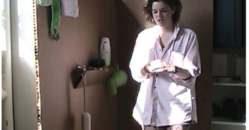
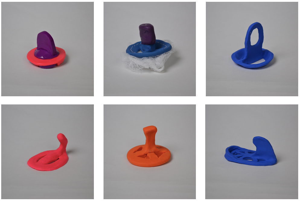
To test the feasibility of a semi-solid soap, a prototype of body-wash and gelatin was used to aproximate the washing experience. Different prototypes were also created to explore the form and delivery of the device. Users were also interviewed about their showering habits.

Based off of user testing we found the form users liked the most. Using our experiments in soap gels, we created a soap shape that snapped into the holder but dissolved when used. The soap could be delivered in a dispenser that makes it easy for shower use.

Running Clutch

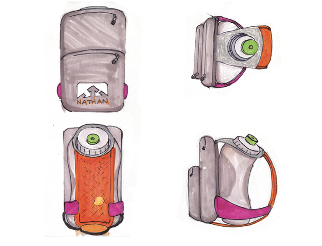
NATHAN, the Running Essentials™, known for their hydration packs, wanted a hybrid hydration/carrying solution for active women. NATHAN’s product line focused on specific activities, like running, but none were able to go from activity to lifestyle effortlessly.

Observation

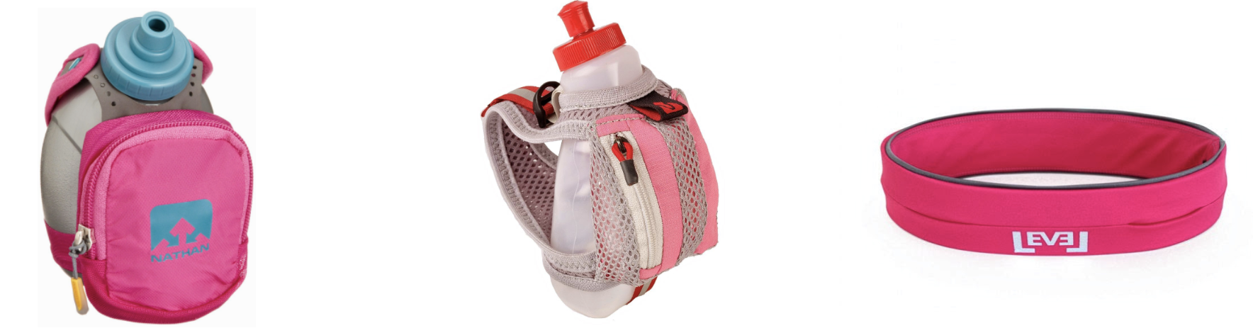
Interviews and observation of runners found they carried music players, cash, keys, and water bottles while running. The project scope then shifted to focus on non-hydration solutions. Normal clutches were investigated for size, use and contents.

Testing

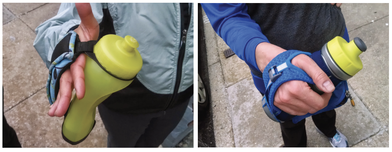
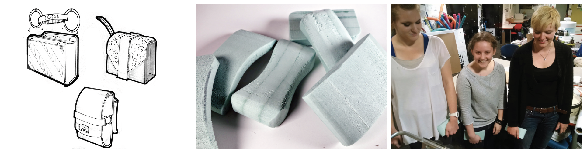
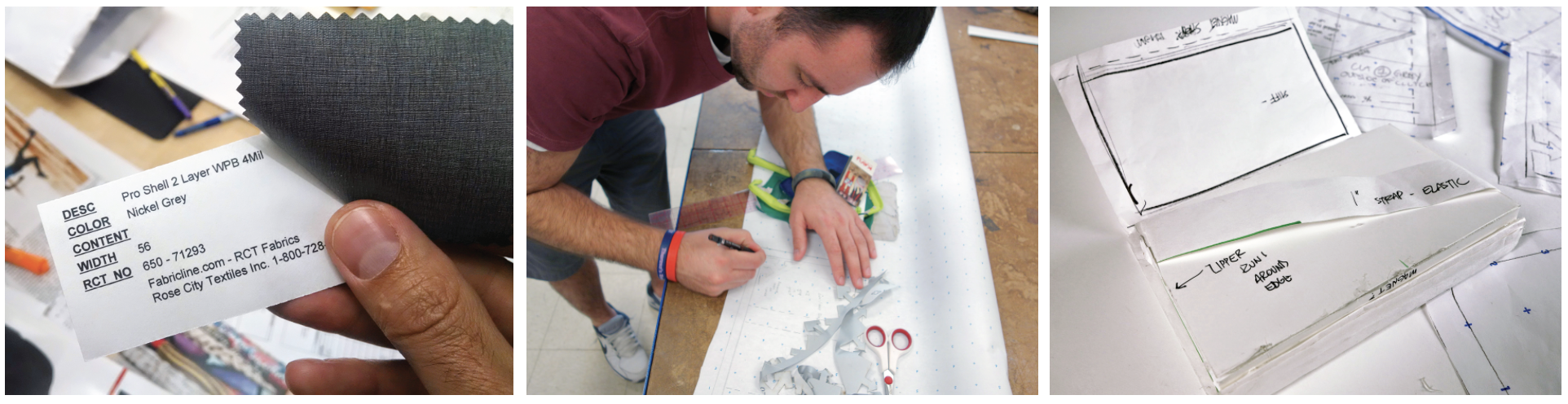
Sketches and ideation of the overall concept. Foam forms were tested for ergonomics. Fabrics were chosen for color, feel and functionality. A pattern was then constructed.

Prototype

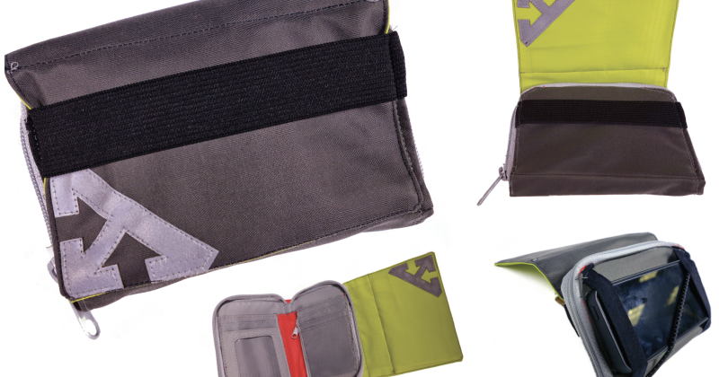
The team designed a clutch that can flip from running mode to lifestyle mode. In running mode, the flourescent flap is visible, while hand and phone straps give easy access to your music. Lifestyle mode folds to be inconspicuous as the hand strap ooubles as a clutch closure.

PPA Parking Kiosk

The Philadelphia Parking Authority is not loved here in Philadelphia. Their attendants have an uncanny sense of knowing when your parking meter will run out and I think actually enjoy towing people. They even had their own reality show for a little while. Despite the malice directed towards the PPA, my team looked at ways we could improve the parking experience - and perhaps smooth the transition between driving, parking and walking in Philadelphia.

Observation

Our first goal was to observe how people used the PPA parking kiosk. After hours of documentation, observation and user-interviews, we felt we had determined a few pain points of the current kiosk.

Expert Knowledge Neeeded

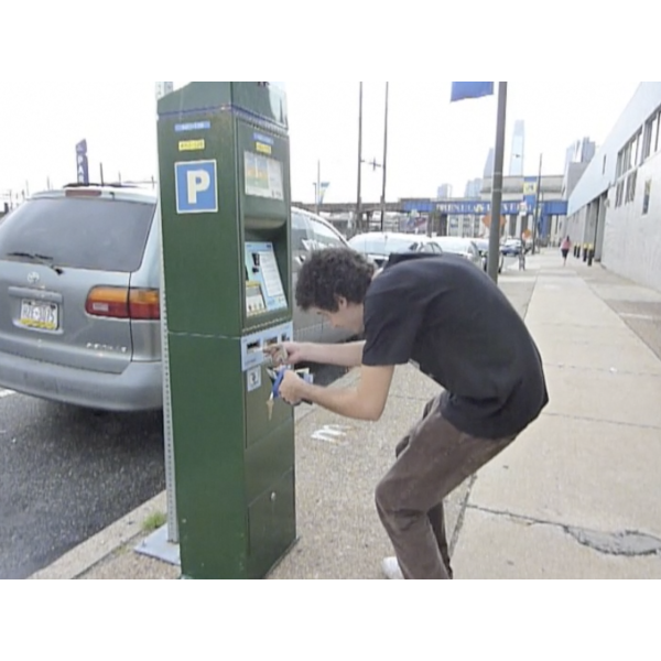
First-time users were often confused with the “correct” way of how to use the kiosk. The instructions were illegible and located away from their corresponding items. The money, ticket and credit card slot were too low, causing people to stoop to feed the money into the kiosk. The buttons added a layer of abstraction since they point to their corresponding commands and those commands change, depending on what stage you're at in the ticket buying process. It was clear first time users of the kiosk were very confused with what they were supposed to do, though experienced users seemed to have no trouble.

Prototyping and Testing

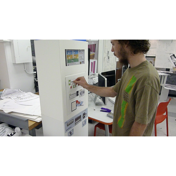
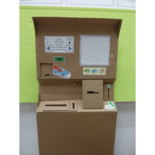
In order to test different interfaces of the kiosk, the team built a foam-core mockup of the current kiosk and tested different layouts and work flows.

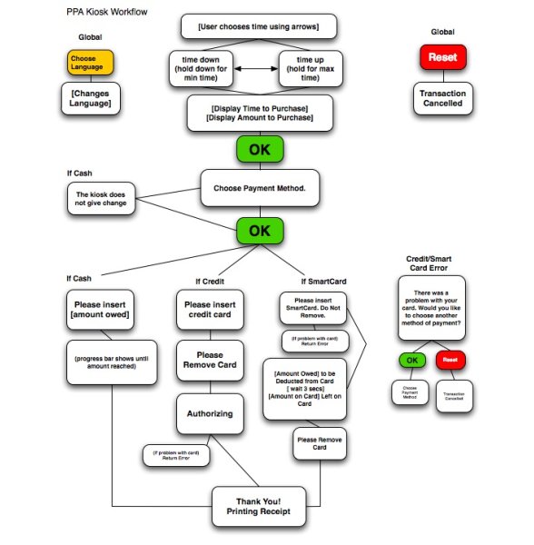
A flow new flowchart and interface layout informed us how the new kiosk could work.

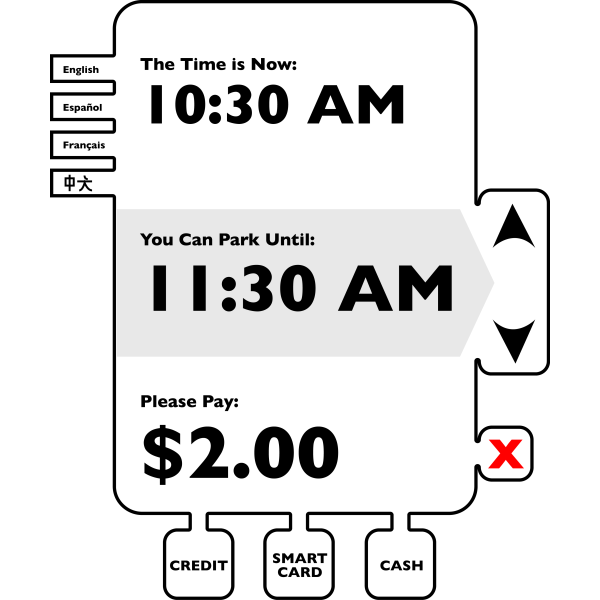
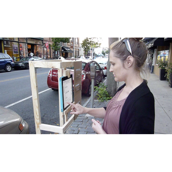
I took the new interface and coded it into HTML in order to make a functional prototype users could interact with. I built a very, very rough wood mockup of the kiosk, set an iPad in it, and asked random strangers on the street to use it. This informed the team whether or not the new interface was an effective solution.

Design of Kiosk

The next step was to find a design that could make the kiosk stand out more and solve for the current kiosk's poor ergonomics.

Another foamcore mockup was made in order to reliably test the physical ergonomics of the new kiosk.

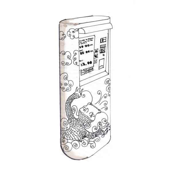
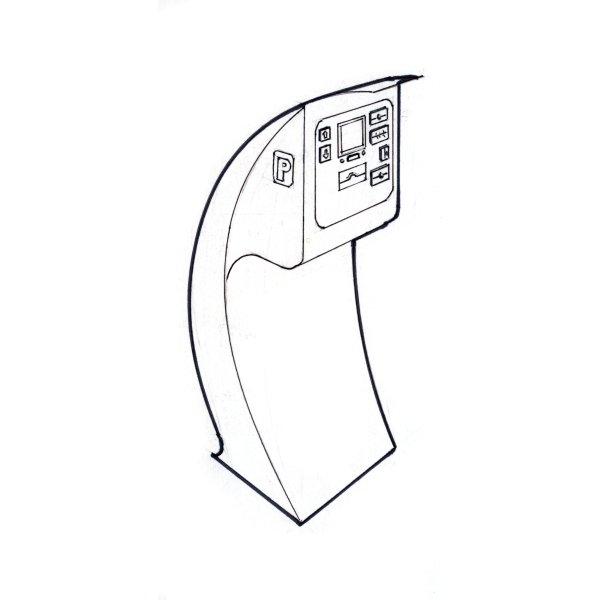
A 3D render was created to show the kiosk in context of its surroundings. Since people complained about the kiosks being hard to find, the signage was accentuated. The inspiration was a blade of grass next to a stream, not unlike trees on the side of a road.

G.E.L.

Johnson & Johnson challenged the team with finding the future of wound care. The boundaries were fairly open, so we were free to explore different avenues. We focused on bandages and what opportunities could be found there.

Brainstorming

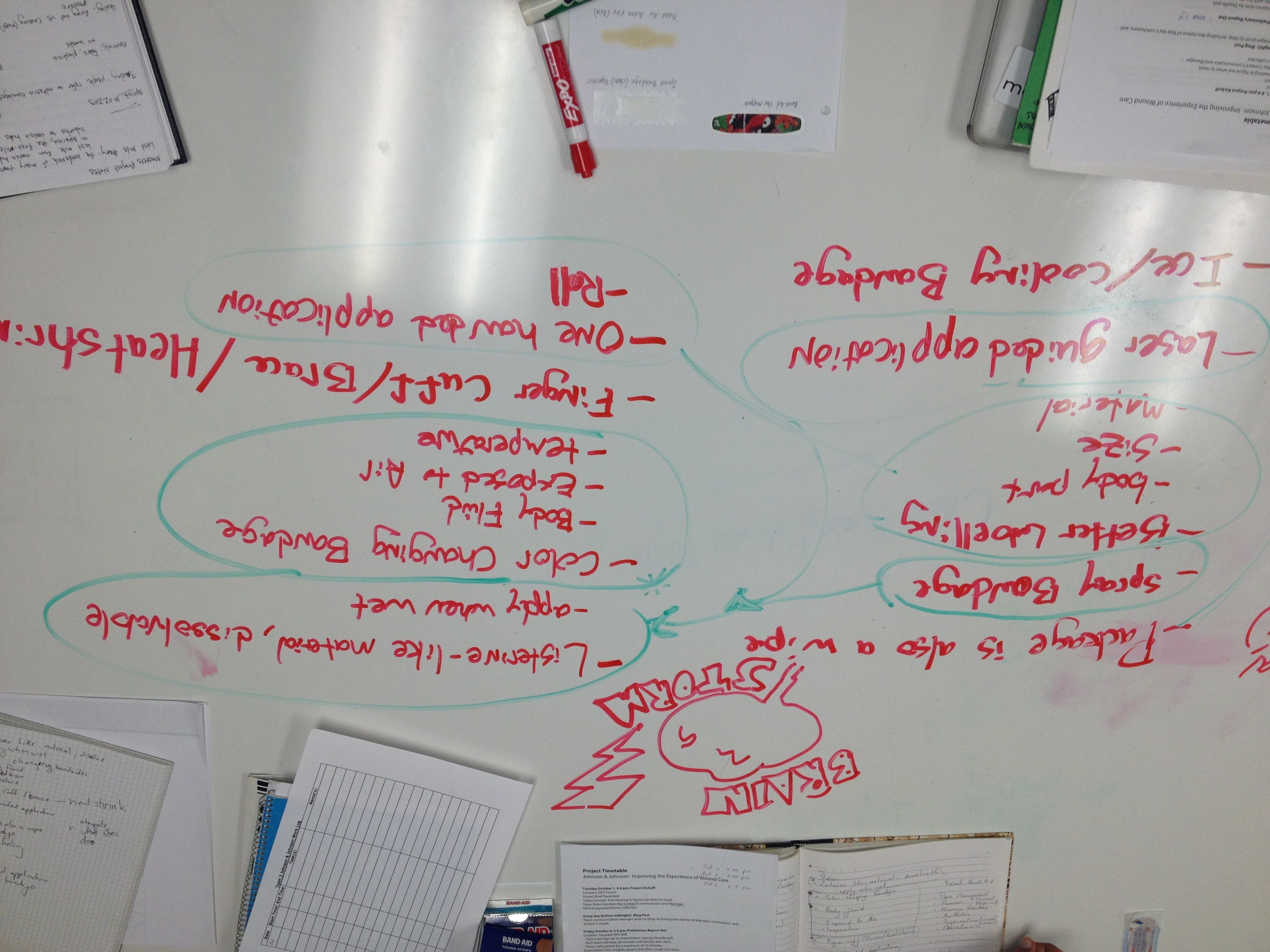
The group, made up of designers, engineers and business developers, started by brainstorming areas of opportunities and various pain points in the bandage process.
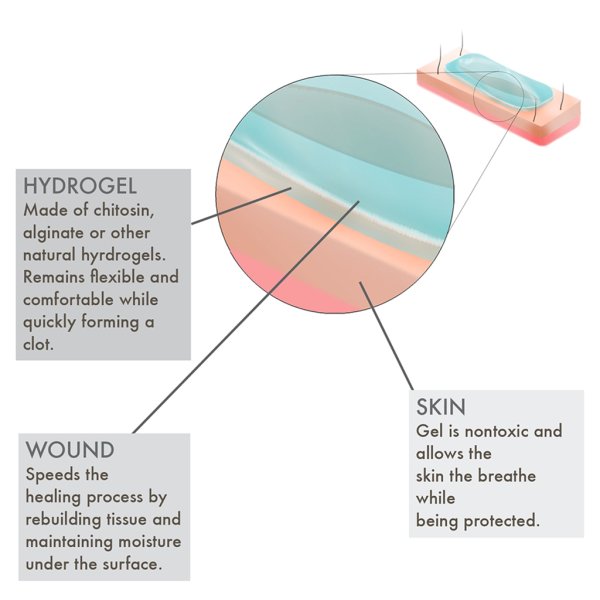
The team came up with a solution involving hydrogel. Hydrogel is made of chitosan and is being researched by the military for on the field wound sealing.

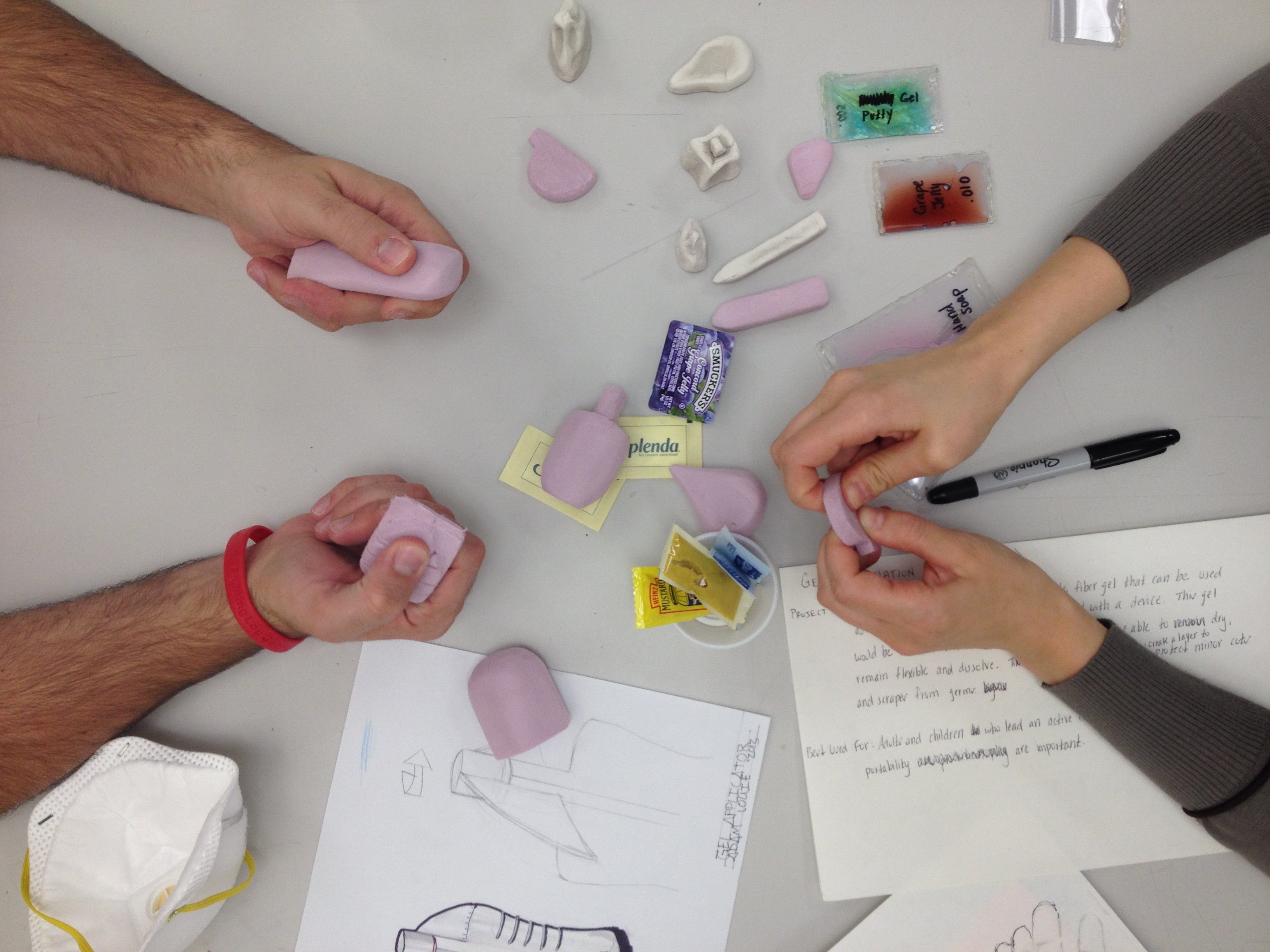
Sketches

We needed a way to dispense the gel. Various sketches were made in how best to store and deliver the product.

Prototyping

To take the concept further, the team attempted to create a few prototypes to test the feasibility of the delivery.

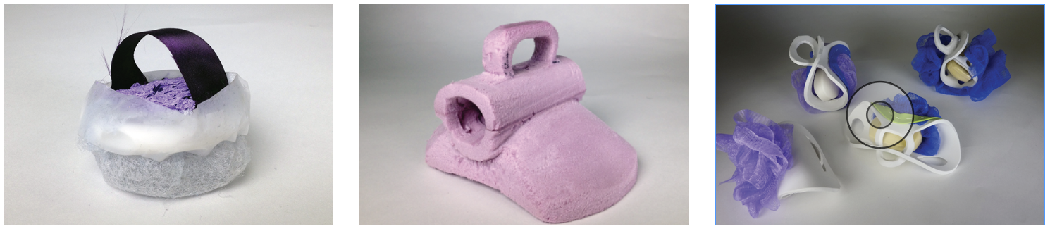
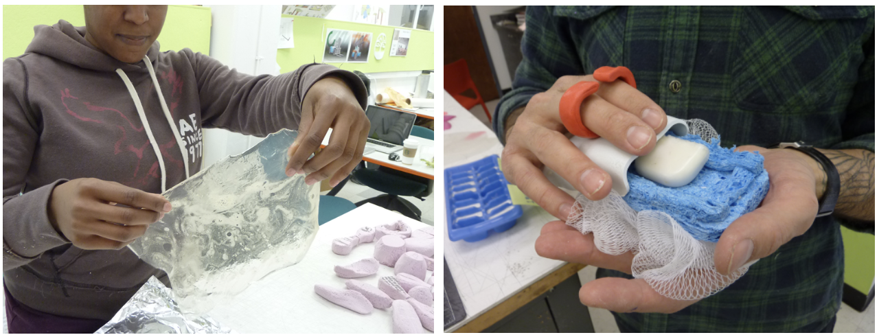
Pink foam mockups were tested for form and feel.

A packet filled with hand soap was created to test how the action of applying the gel would feel to users.
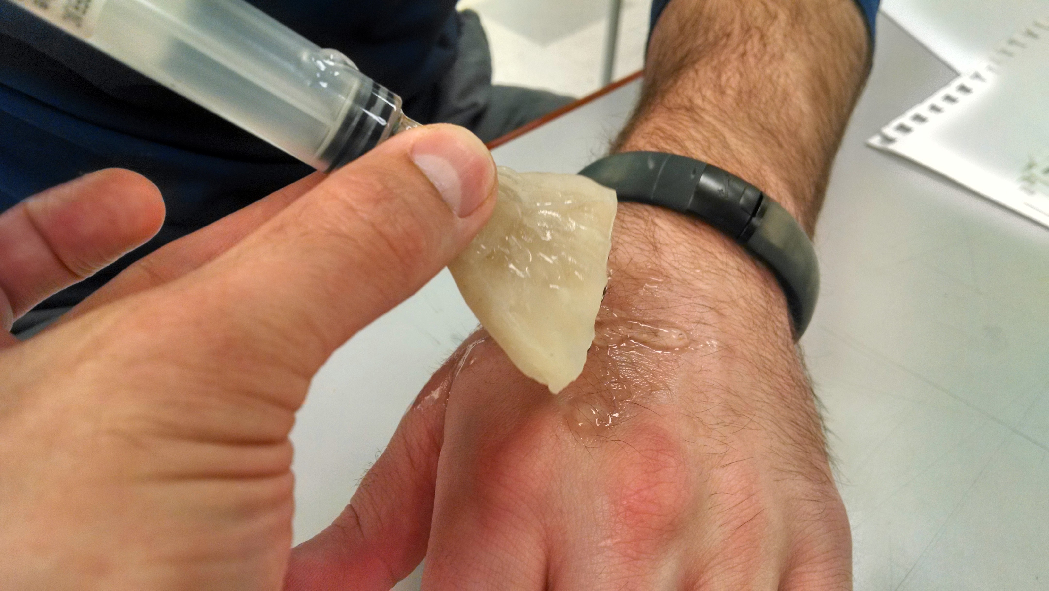
A basic form made from Sculpey and a syringe filled with hand sanitzer was used to test the application of the product.
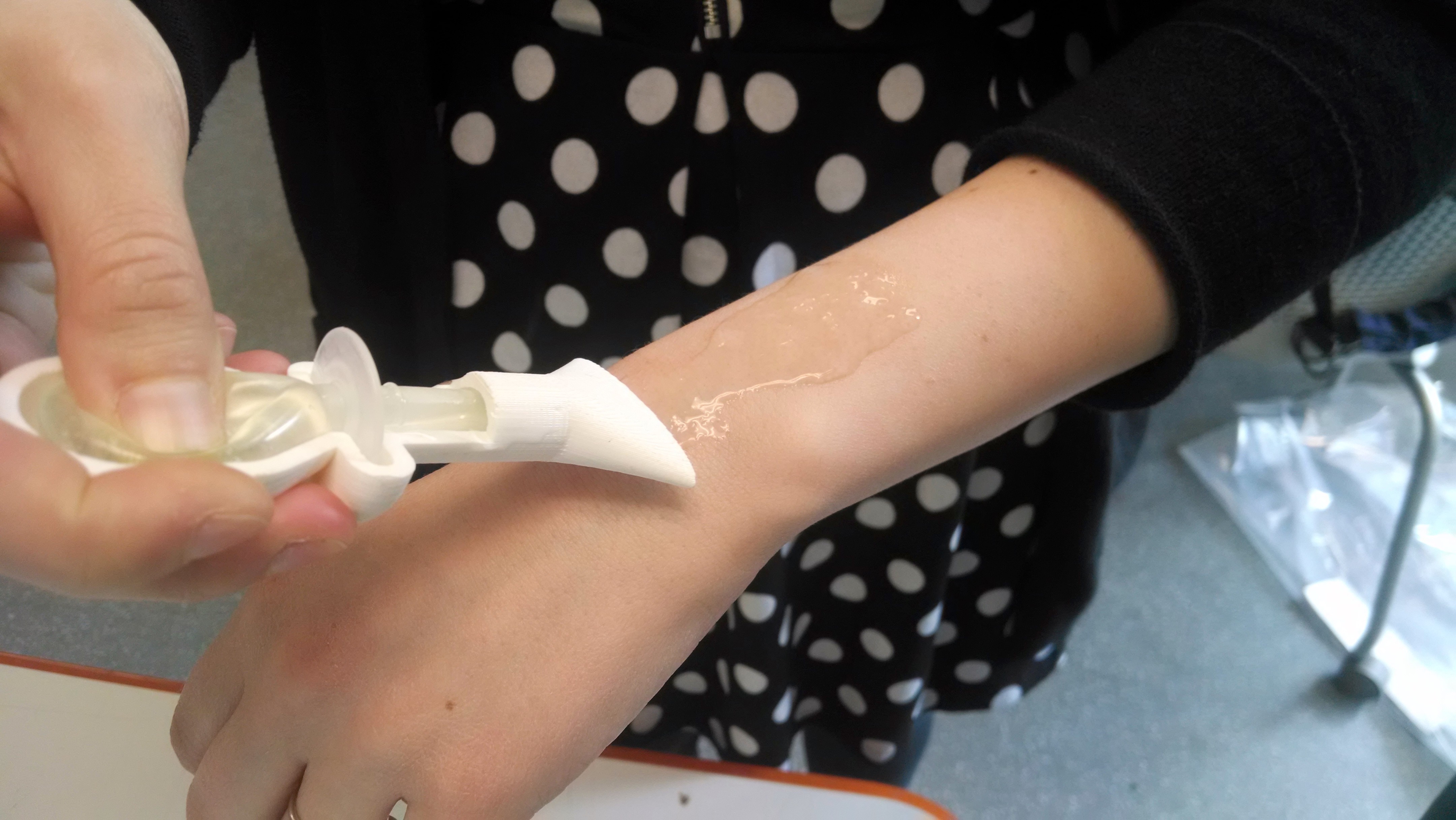
A more refined version of the Sculpey model was made, which faired a little better. A supository bulb was used to hold the product. This design informed us that the applicator needed channels to control the delivery in a uniform manor.
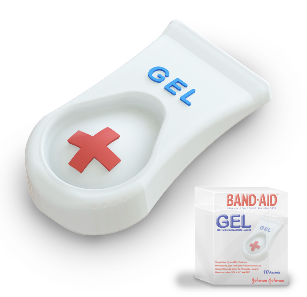
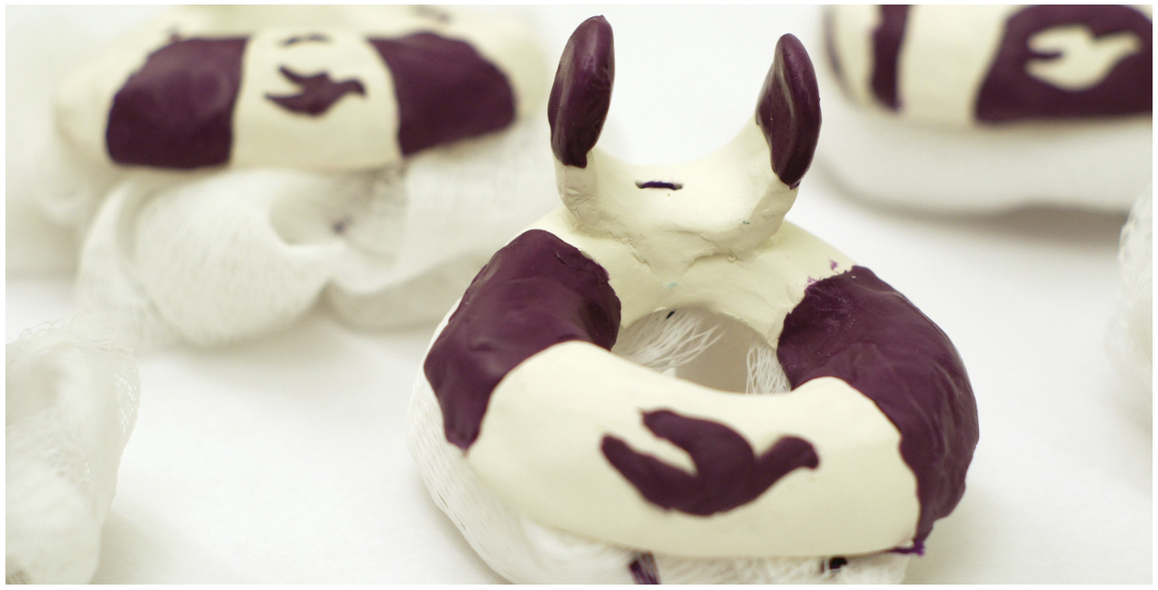
The final concept.
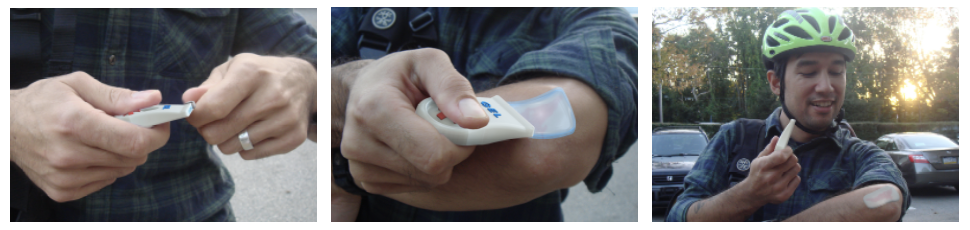
A photoshop recreation of the process.

Customer Communications

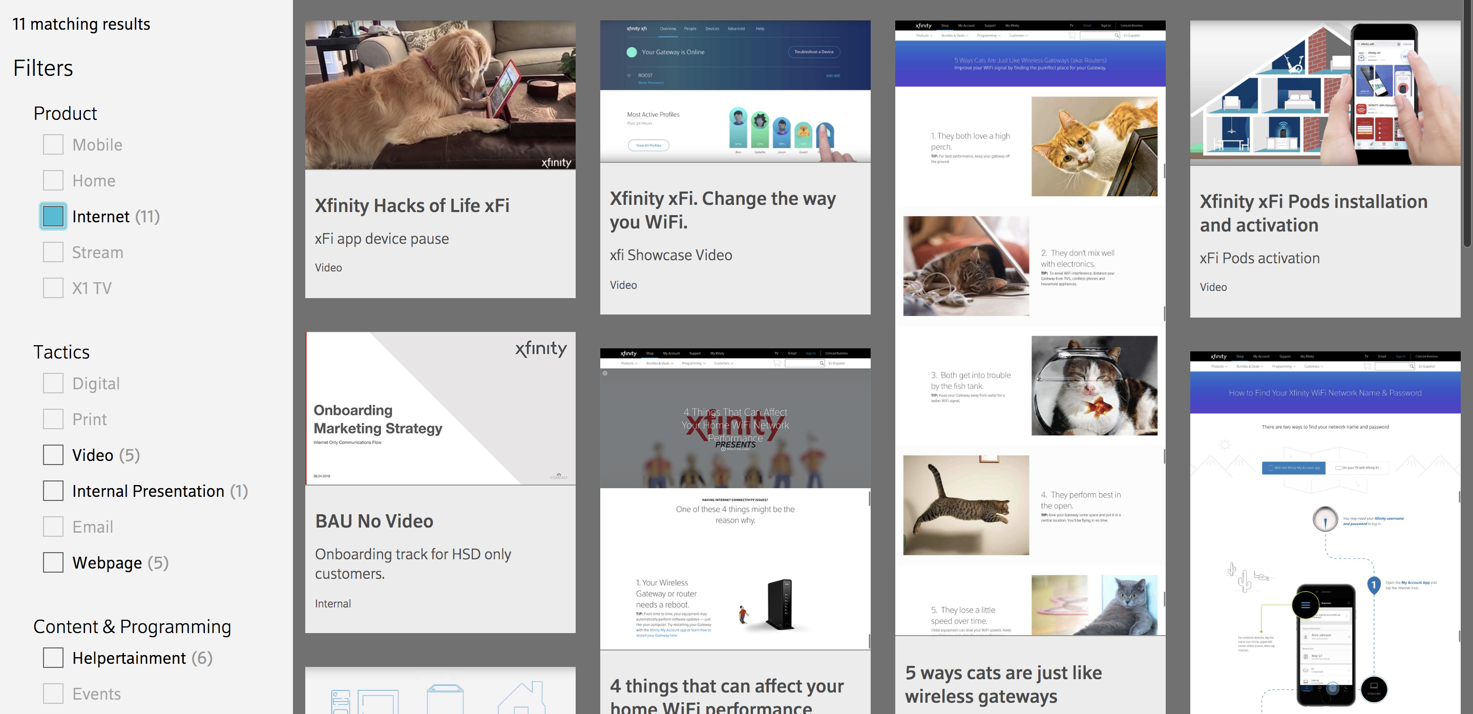
Comcast asked us to create a repository for their past projects and present them in an easy to navigate, shareable and highly visual way.

Wrangling Content

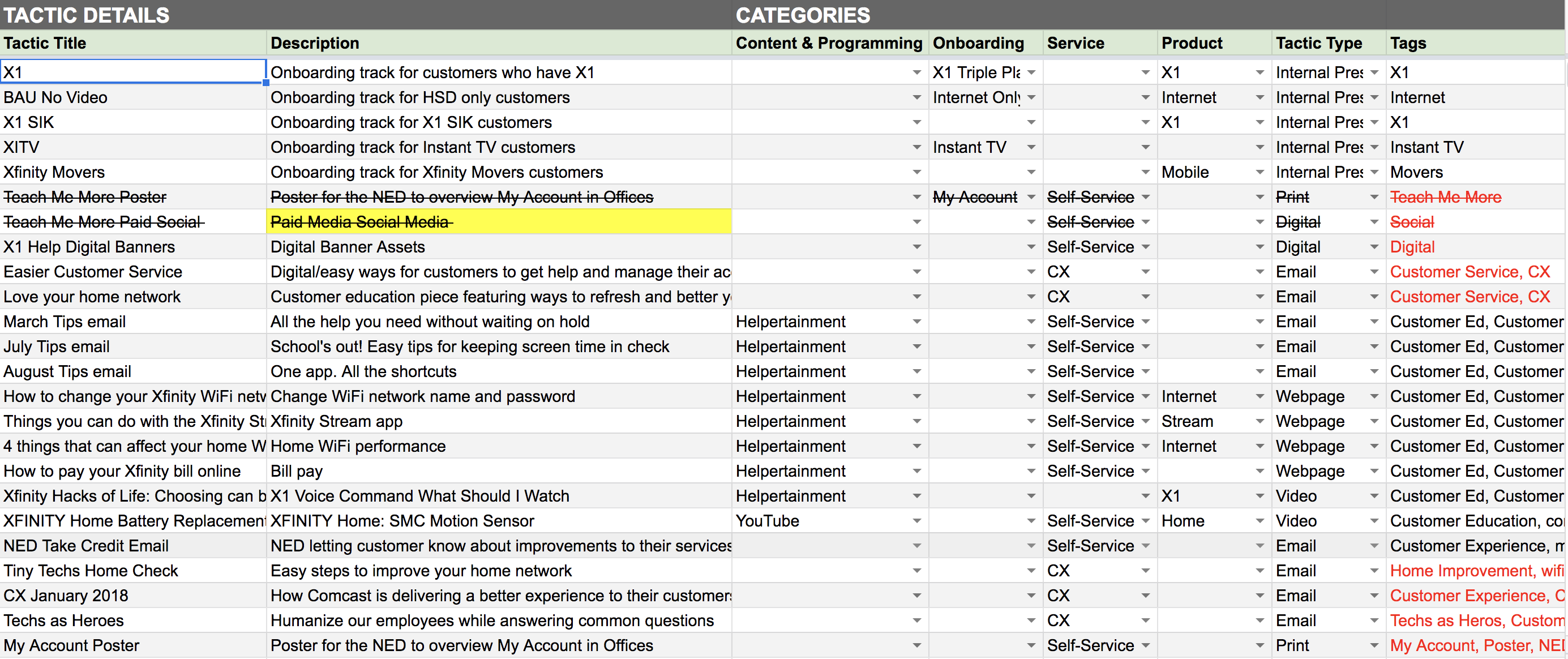
Our first challenge was to organize the overwhelming amount of content from each team, each of which had different requirements. The easiest way to get wrap our heads around where to begin was to create a spreadsheet and have point people from each team fill in the content themselves. Agency M's stellar content strategists consolidated the content into a more manageable form.

Wireframe to Prototype

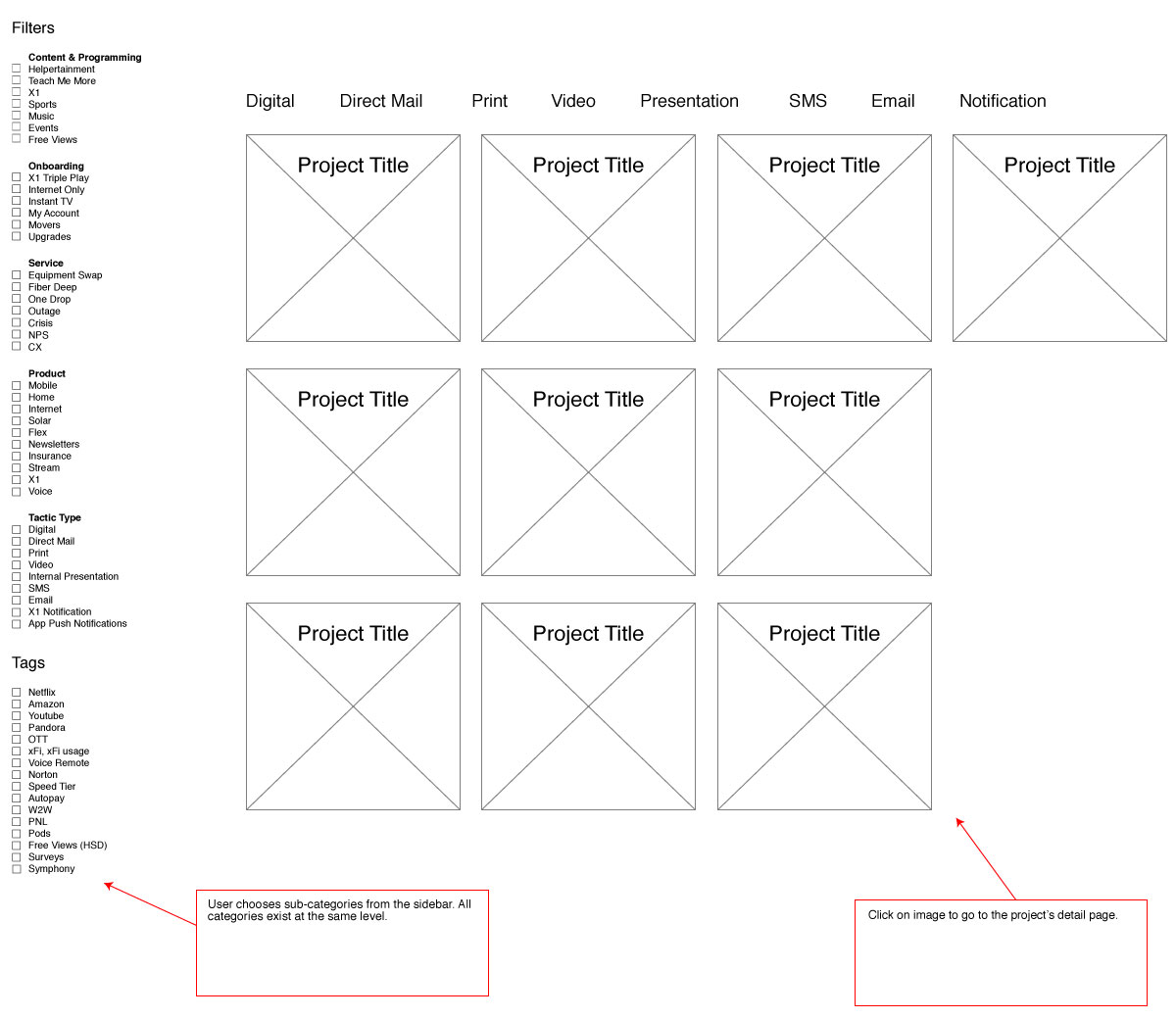
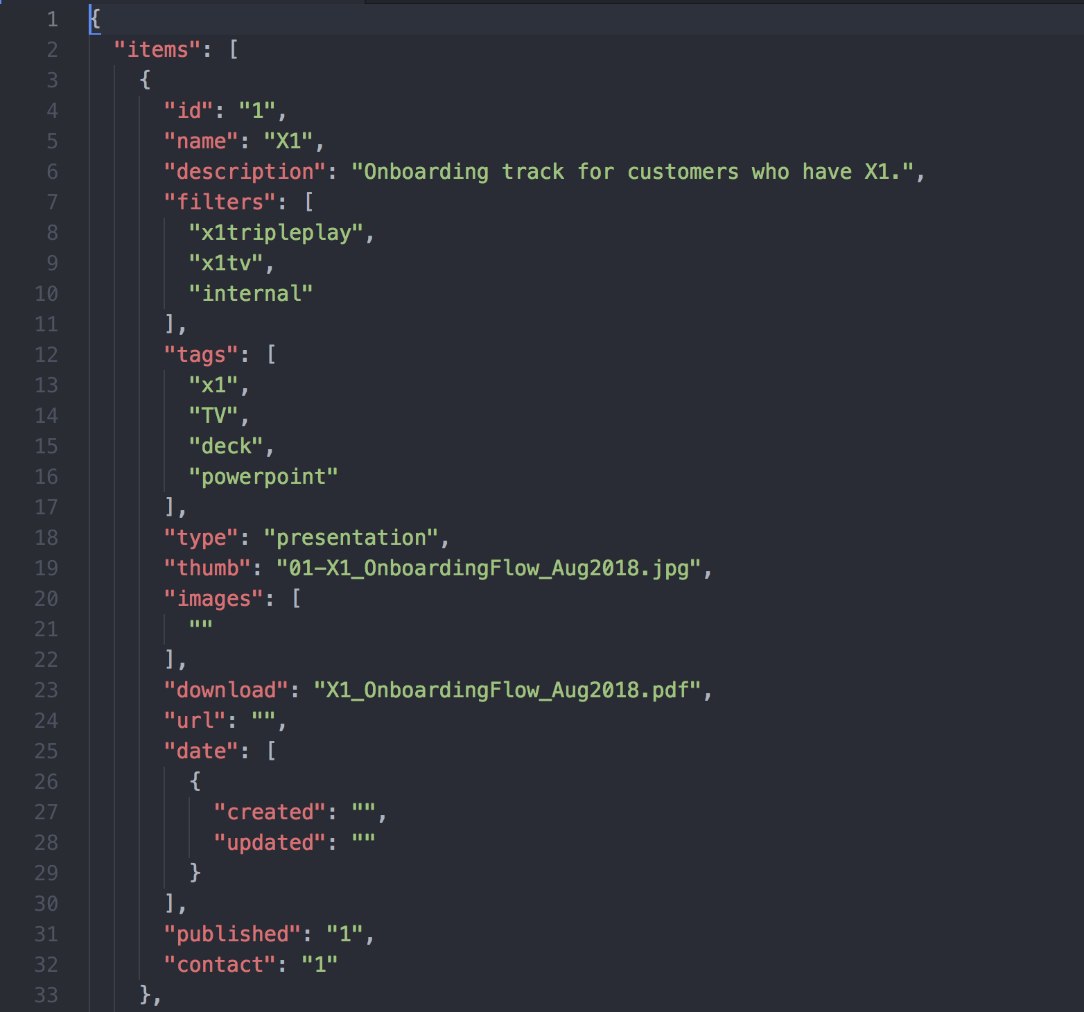
The next step was to take the content and translate it to something visual. I created a quick wireframe to show my thinking. However on further discussion, it was decided it would be faster to code a functional prototype. In the interest of portability and security (no databases), I used JSON to store the data and PHP, JS, CSS and HTML to present it.

Prototype to Launch

Since the prototype was functional enough to test on, I was able to perform some basic UX tests around the office in order to progress with certain design decissions. For example an early concept used drop-down menus for filter selection, but after testing, I found they were clunky and hid too much information. The user needed to see what options were available and how many options were left. They also needed a variety of ways to find the content. A search function and invisible tag system was created to aid with terms that may be unfamiliar to certain users (Comcast loves their acronyms).

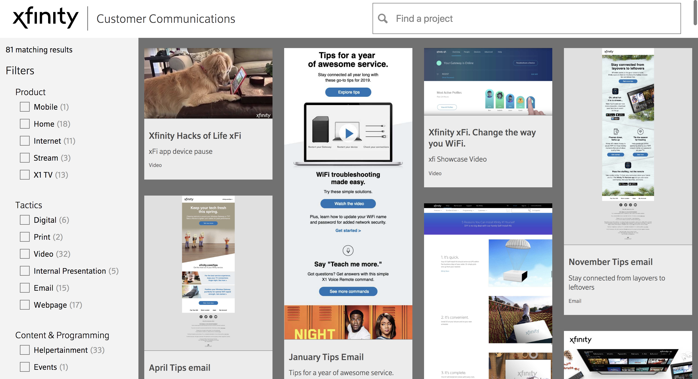
The presentation of content.

The content being filtered. As each filter is applied, the site recalculates what is left and deactivates the content that does not apply, quickly narrowing down your options.
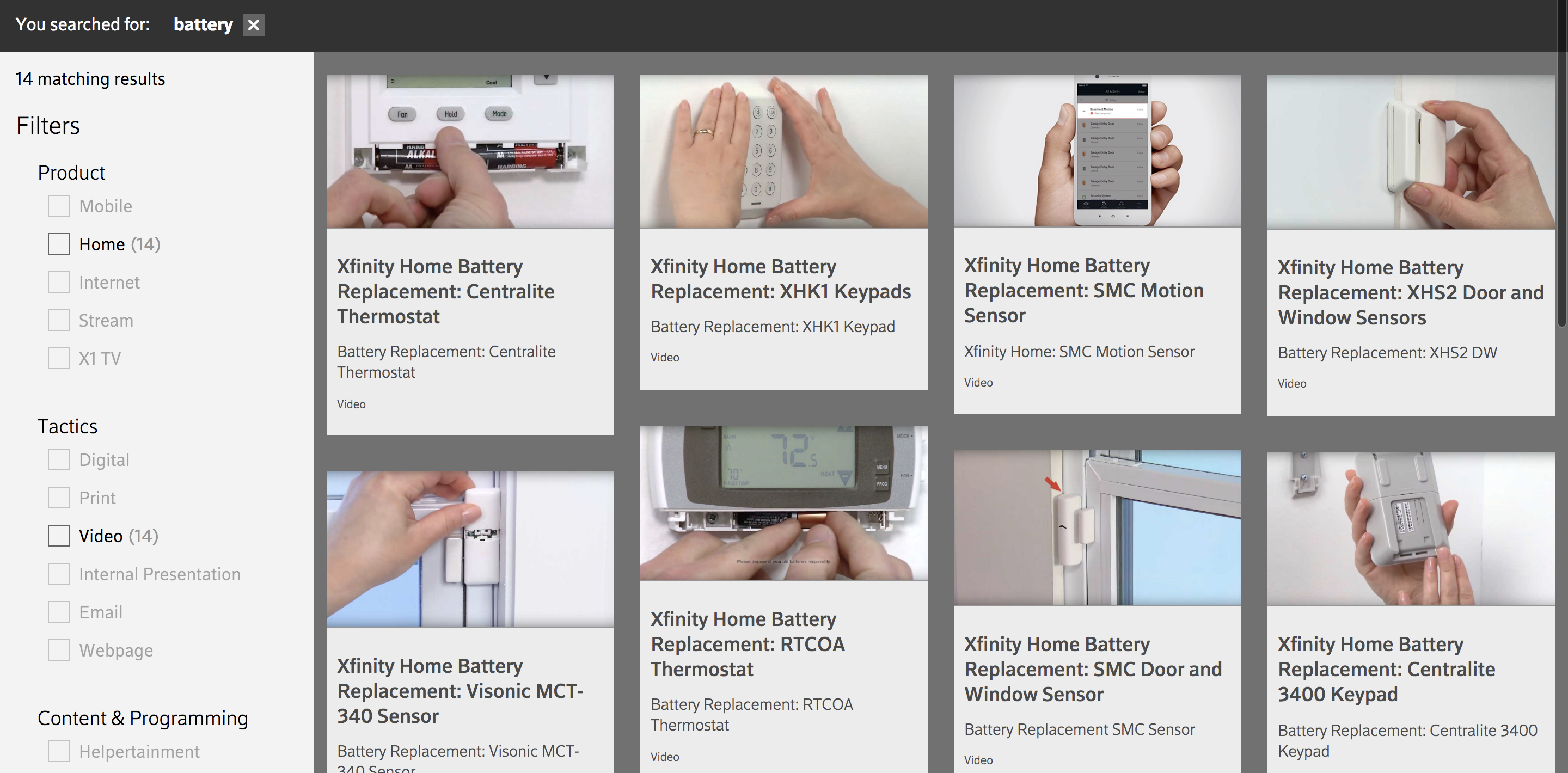
The search function showing all content that has to do with the term "battery". The results are available for further drill-down.

The end result is a content-heavy, lightweight code site that moves fast despite the amount of filtering needed to serve up the right content.

XFINITY Watchathon's Binge Box

XFINITY's Watchathon is a weeklong event where TV customers have unlimited access premium channels. To promote the event, we were tasked with creating games that were entertaining but also worked in the content.

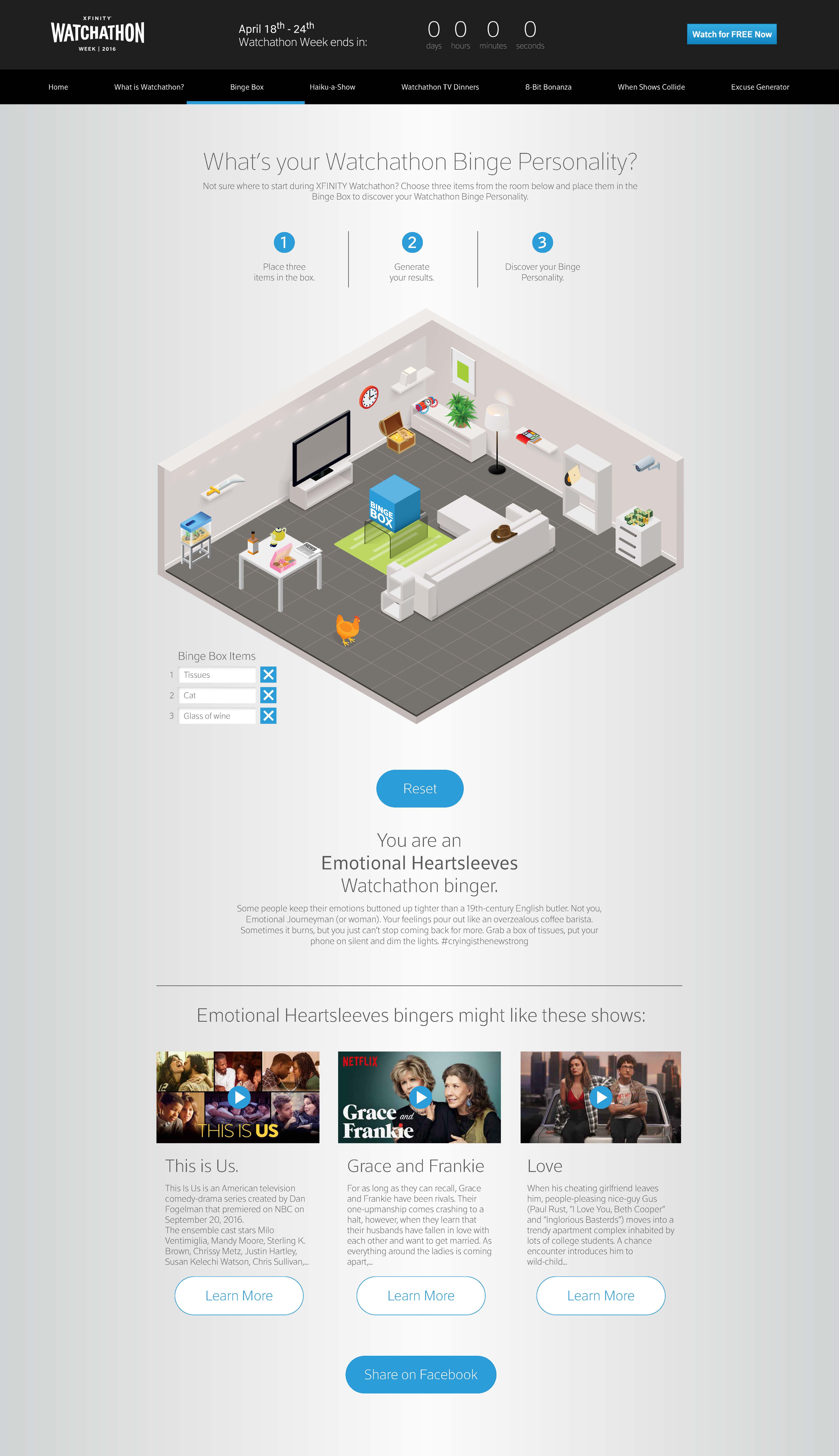
One of the games was The Binge Box. The idea is you put items you need for binge-watching television into a box. When ready, the box will give you a "binge watching personality" and show suggestions to go with your new persona.

Beginning the Process

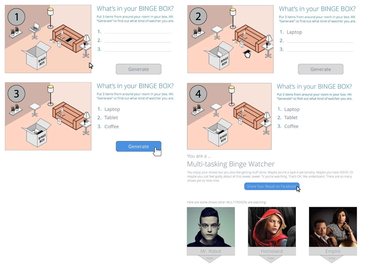
In order to "sell" the idea, I made a rough concept storyboard in Sketch to visually represent the process. Based on feedback and approval, a basic proof of concept was coded and work with the art directors began.

First Launch

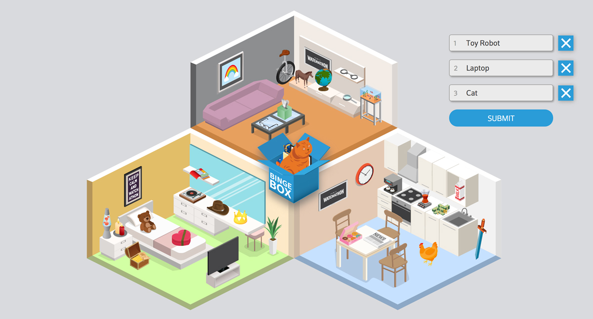
Through the result of lots of collaboration, the Binge Box became functional. Each item in the room was weighted with 3 numbered attributes. When all 3 items were in the box and the button was pressed, the algorithim found the frequency of each attribute and output that pre-written personality. The site gained lots of feedback and pageviews. Bingebox was the longest visited page on the site.
A Year Later

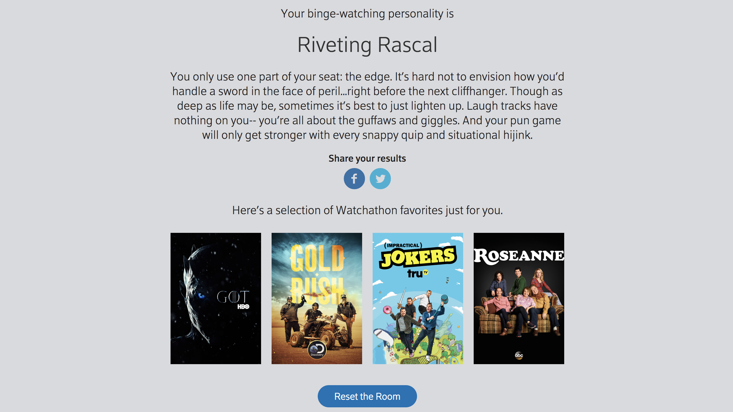
We were asked to do Binge Box again, though this time make it more complicated. After gathering some feedback from the client, analytics and user testing, we decided to increase the number of rooms (more items), and create an two-part persona matching system. One part would find the adverb of the persona and the second part would find the noun. In addition, the copy was written to be swappable regardless of the combination. Each item now carried 6 numbers tied to various attributes. The algorithim would then find the most common numbers from each set and arrange them based on weight (order within the attribute array) and frequency.

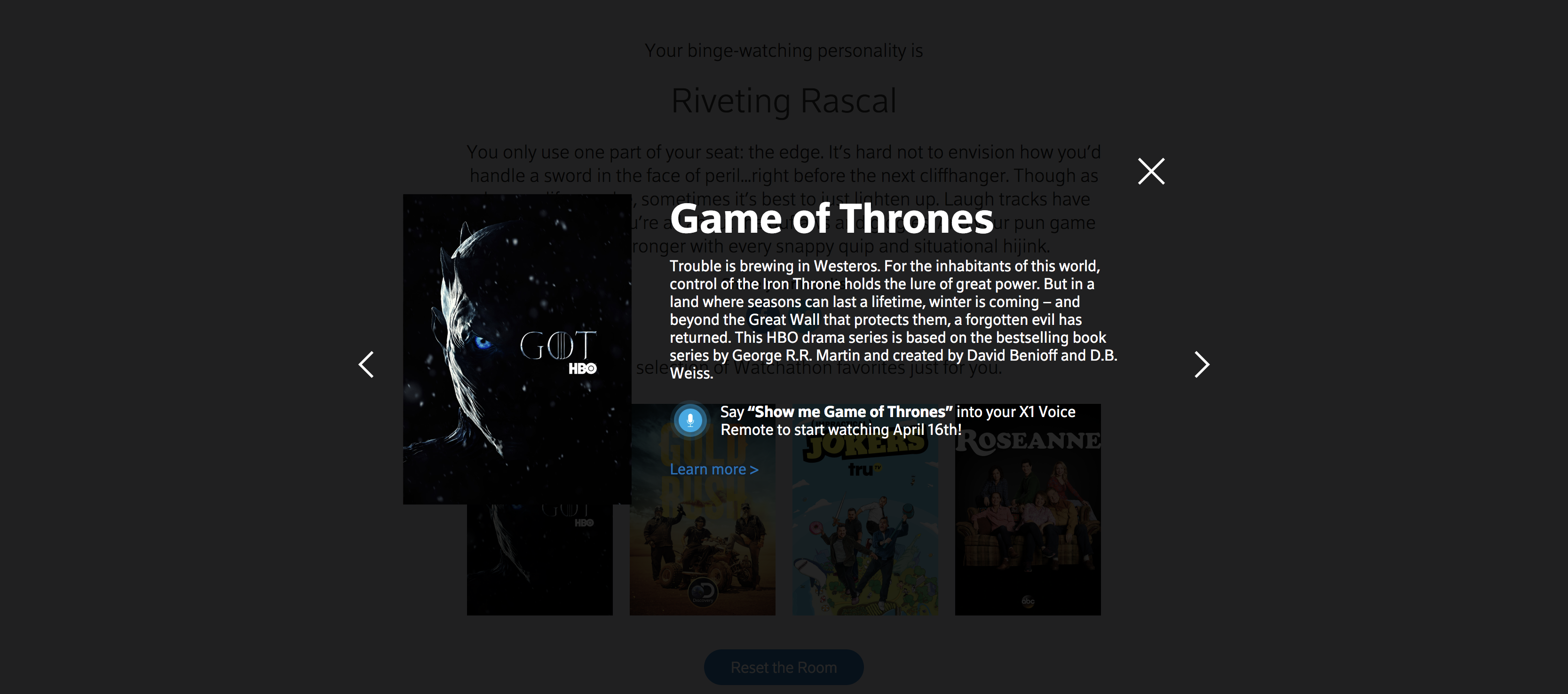
Once you got your "binge-watching" persona, you could click through and browse content. If you were on a non-TV device, clicking the link would send you to XFINITY's online TV portal.